Jam City's Panda Pop
Role: Senior UI/UX Designer
Time: Ten Months (2019-2020)
Platform: Mobile
Engine: Unity
Panda Pop is a bubble shooter game on iOS and Android. It is now seven years old and still going strong. The players love the cute style and the difficult puzzles. There's a wide array of events running at any time.
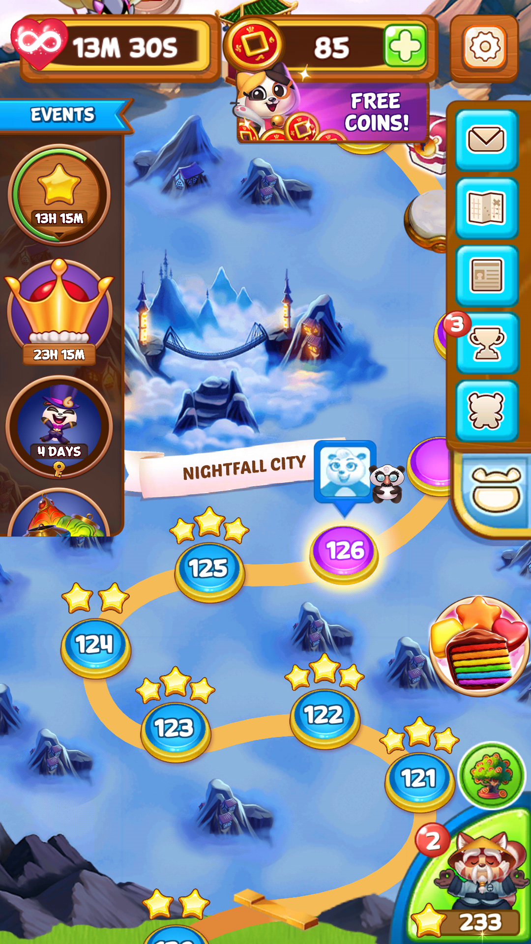
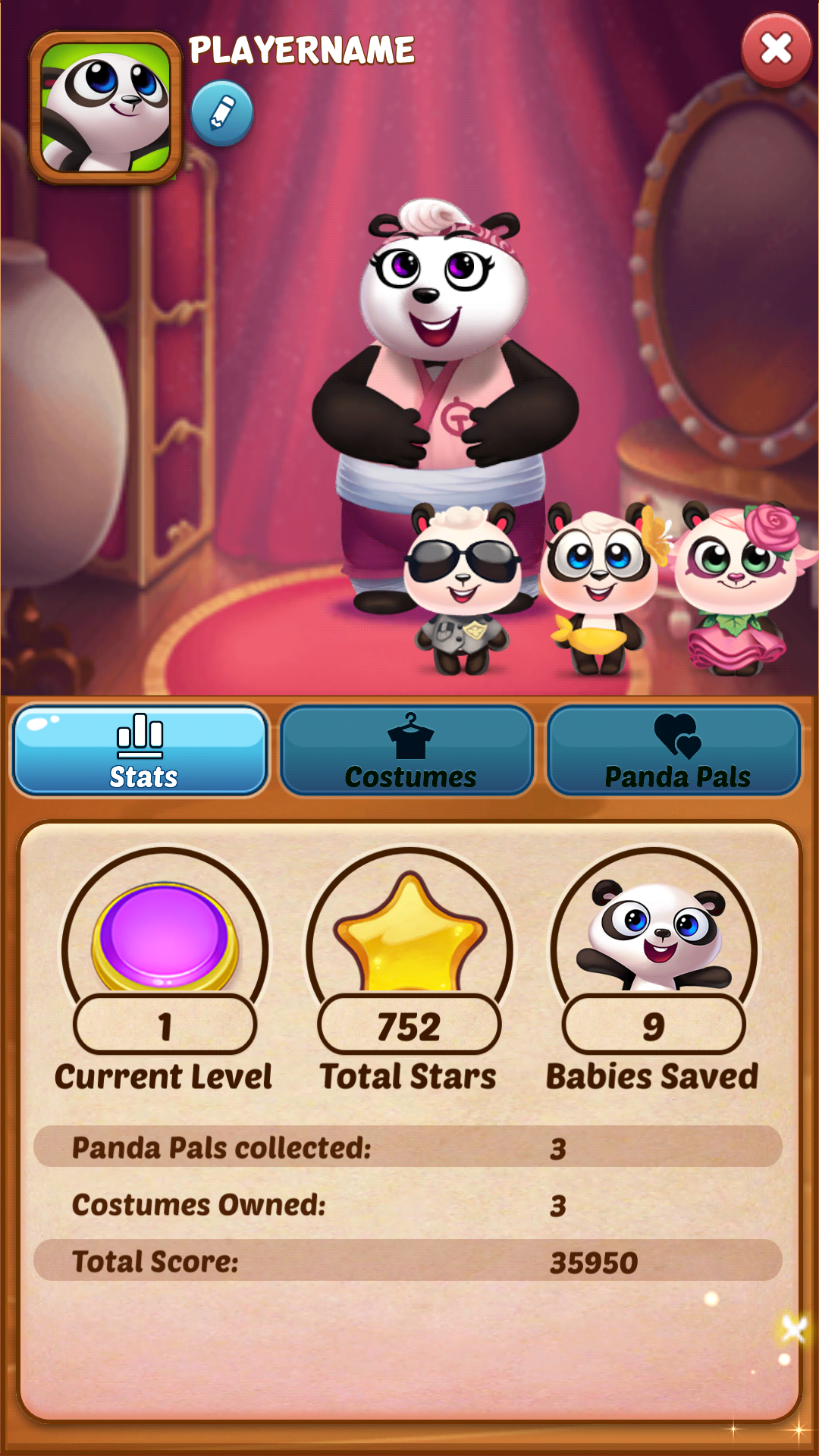
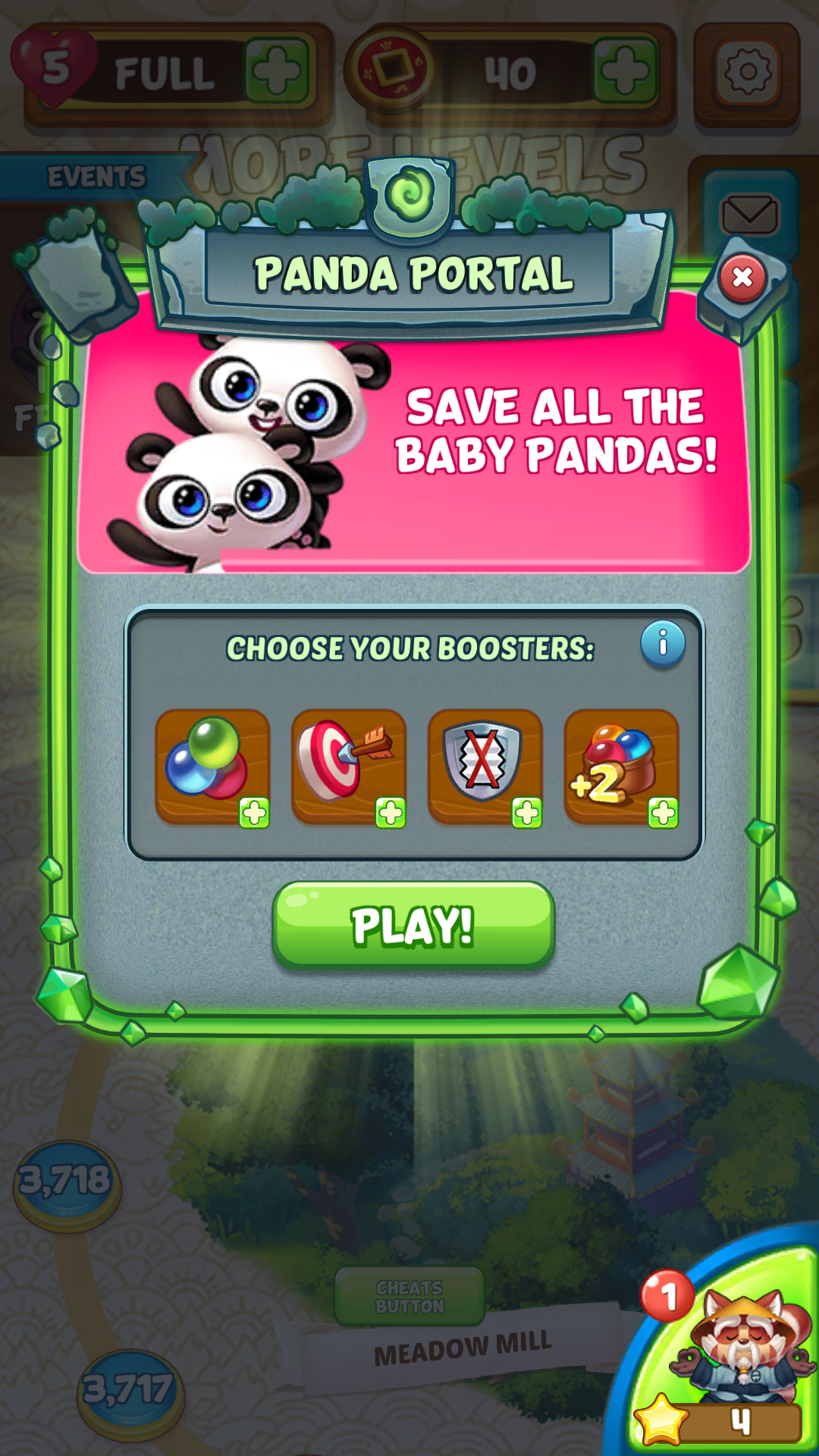
The Main Map screen and a few pieces of UI I worked on for the game.
My Role and Growth
I was brought on the team as a mix of User Interface artist as well as a User Experience designer.
My Responsibilities
•Collaborate with the game designers to understand product goals
•Write UX docs, create flows, and create wireframes. Identify potential edge cases and failure states
•Seek feedback from stakeholders and iterate quickly
•Create prototypes based on need
•Create the UI, cut it up, and implement the UI into Unity
Feature Example Showcasing Process
While on Panda Pop, I worked on quite a few features. I will go through Panda Profile to as an example of my general process.
Panda Profile is essentially the hub of player expression features. In their profile players can see their stats, switch Mama Panda's costume, and change out their Panda Pals. The player can adjust their name and profile picture. Player bubble baskets and profile picture frames were also slated to appear at a later date.
Product Goals
•Give players a central location to adjust their self expressive features.
•Use this area to showcase new premium items.
•Showcase items in an eye-catching way.
•Area needs to expand to include more items.
Audience
•Casual mobile gamers.
•Age Range 30-60, with heavy leanings towards women.
•This area should appeal to both new and existing players.
Design Challenges
•There wasn't much space on the page
•Due to tech constraints the player can only have up to 3 Panda Pals assigned at a time
•Space needed to be expandable for more costumes, Panda Pals, features, etc.
Research, User/Design Stories, and User Flows
Naturally what comes first is research followed by research, and then once more, a little research. When researching for this feature, I made sure to check my product goals and audience. Based on those parameters, I knew that the feature had to "just work" and not require much thought from the player. It also had to be delightful and make the players want to return. I looked at other games in the genre, as well as games with highly customizable avatars such as MMOs. I also looked at social media sites.
Working with the game designer we would polish up my rough sketch of user stories and design stories. After both the game designer and myself were satisfied with the stories we would show the rest of the stakeholders.
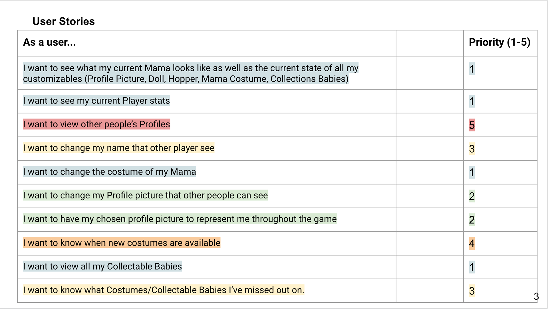
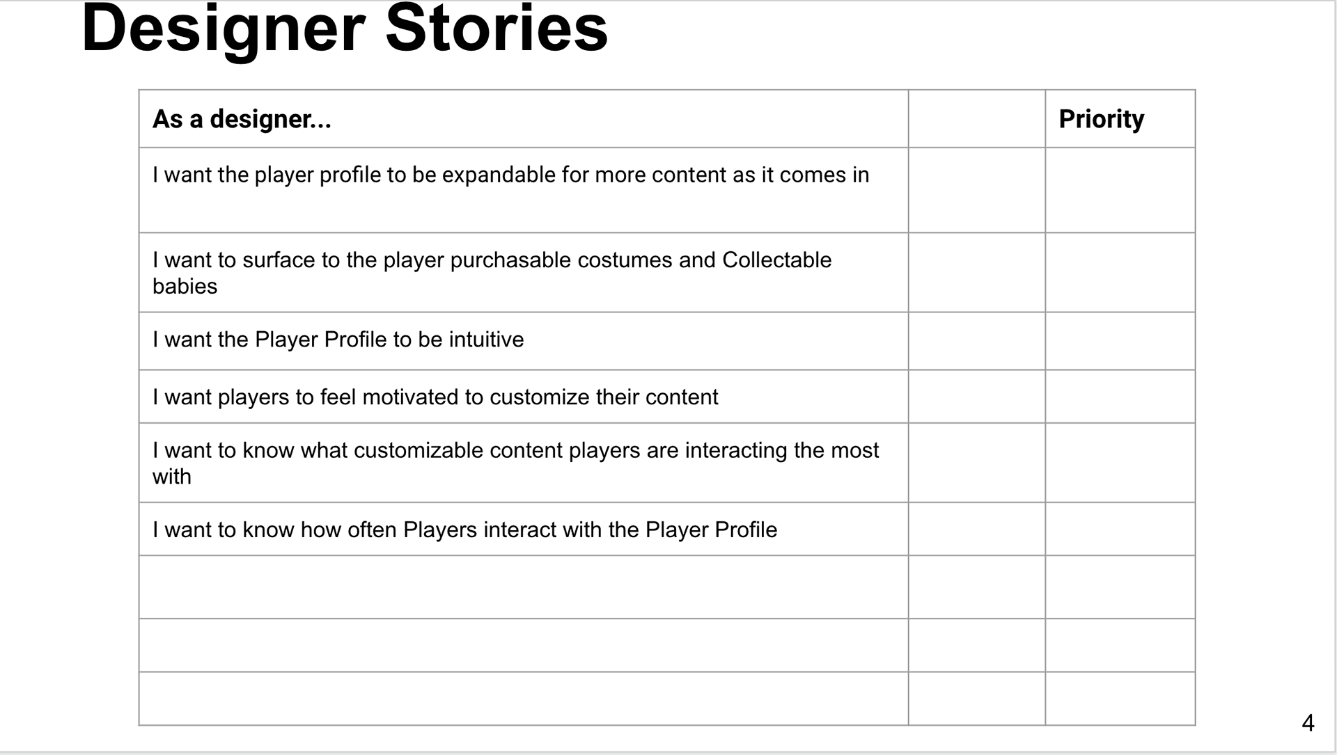
These are the User Stories and some of the Designer Stories I wrote for Panda Profile. Design wanted to feature to be bigger than the time we had to create, so I worked with Product to prioritize the stories.
After alignment on User Stories and research materials, I would move onto creating User Flows. This is a crucial step because it allows me to step back and think about the Player Journey. It's at this step where we start to suss out the different paths for players based on their game progression.
For Panda Profile, it was a new feature that needed a new system. Now that these systems exist in the game, they're used for delivering rewards that live in Panda Profile.
A few flows from Panda Profiles. These showcase some of the different player flows that I had to account for.
Wireframes and UX Documentation
After getting alignment on the overall flows and early wires, I moved onto more detailed wires. I would sketch out a rough idea, and then start to ideate on placement, expansion, user interactions, etc.
Generally I like to keep my wires simple, but the Panda Pop team liked more detail in the wires. To make this step go faster, I created a Sketch Library for my wires.
After the wires were created, I would add them to my UX document as detailed flows or anatomy pages. The UX document is fleshed out to include the functionality of the feature, along with any edge cases that might be encountered. Within the UX document, I also would work with the project manager to call out art needs, animation needs, and localization strings.
A few snapshots of the Panda Profile UX Doc that I wrote
Prototyping
Prototyping played an important role in creating holistic flows and wires. In most features, I would often prototype small pieces of the flow so I could get a feel for it and show it to stakeholders. These would be added to the UX doc as gifs and links to the prototype so Engineering wasn't just looking at a static image and paragraph.
Occasionally the team would want a larger prototype to get an overall sense of the feature. Early in the Panda Profile process I created a detailed prototype using Protopie. This was used for User Testing so we could understand where some pain points might be for the player.
Short video of my prototype. This prototype was used in user testing to verify easy of use early on in the process. I made this prototype in Protopie.