Jam City's Vineyard Valley
Role: Lead UI/UX Designer
Time: One and a half years (2020-2021)
Platform: Mobile
Engine: Unity
Vineyard Valley is a collapse puzzle game with a mansion decoration meta wrapper. The game is still running, but has since been handed off to a different studio.
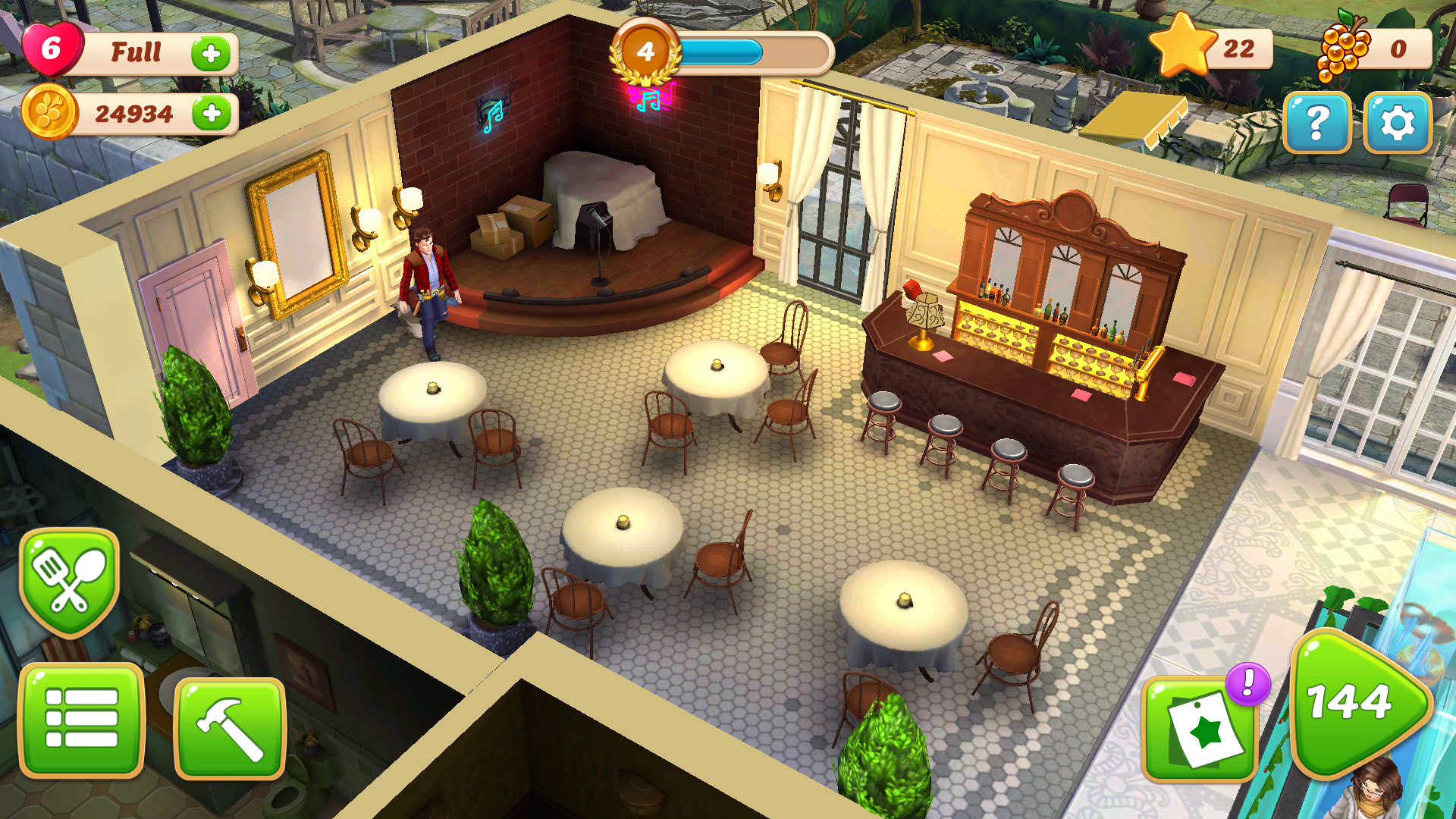
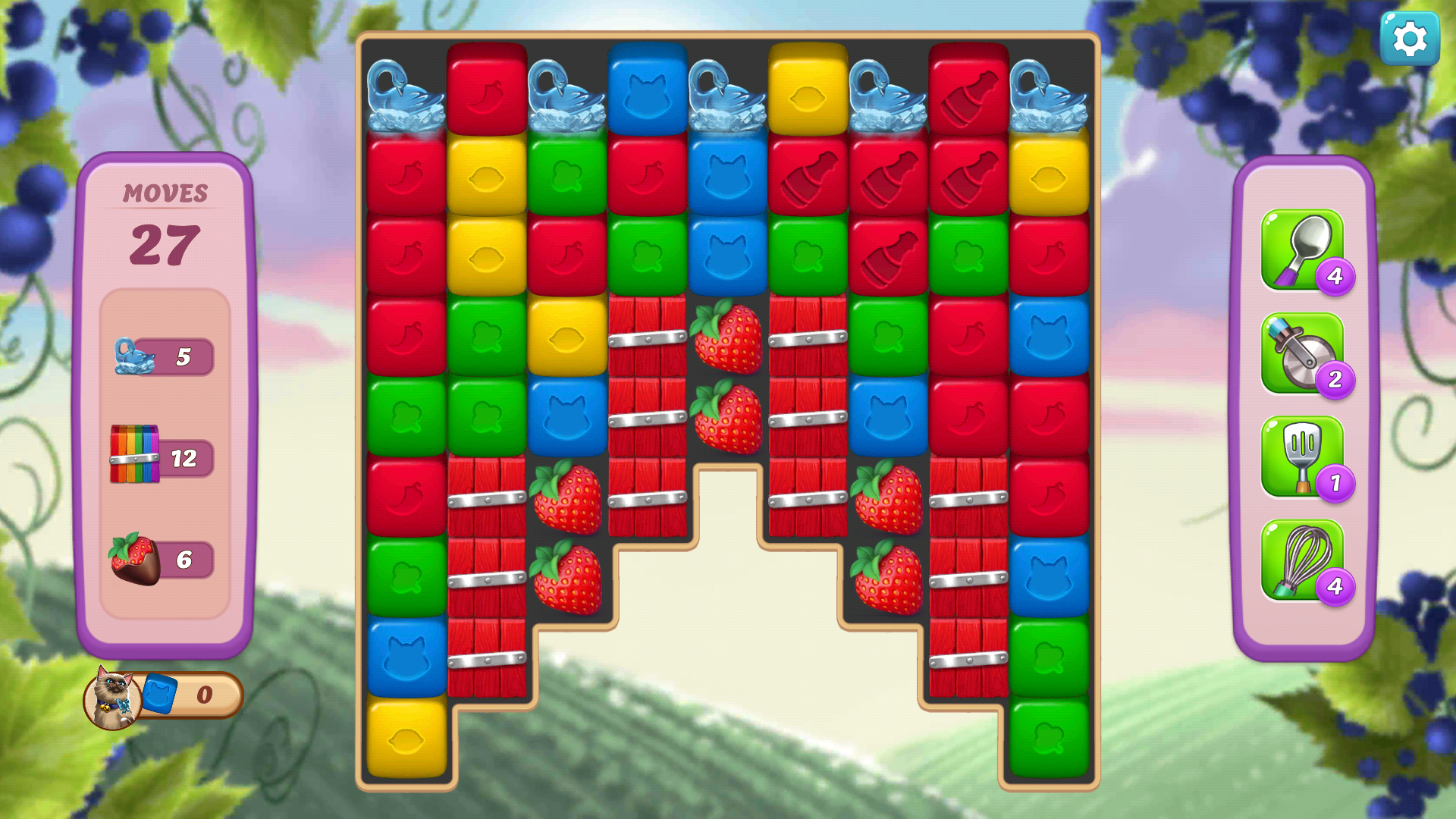
Screenshots of the main screen and the puzzle gameplay
My Lead Role and Goals
I took over the role as Lead UI/UX on the team. By the end of my time on the team, the UX team had a tight pipeline from start to finish and started new documentation trends at the Jam City SF office for different UX teams. While I continued to do a lot of IC work, the part of this team that I felt was most important was the infrastructure I stood up as the UX lead.
My Responsibilities
• To create an internal hub where people could easily find UX documents, UI style guide information, implementation info, etc.
•To work closely with the other teams to help UX be more integrated into the process rather than being a set of hands.
•To grow the skills of the other UX designers by giving them tools to succeed.
•To create scalable UX systems in order to streamline content creation and create consistency.
•To champion and improve the overall UX of the game
•To use my technical knowledge to streamline the production pipeline
•To create delightful and easy to use UX
•To champion, improve, create, and guide the User Interface Art in the game
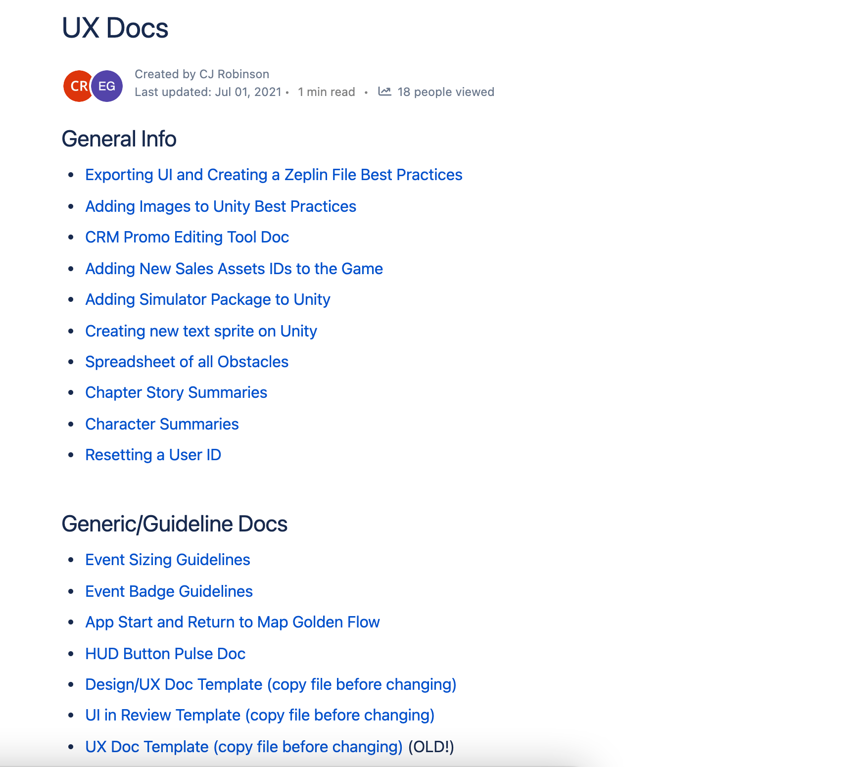
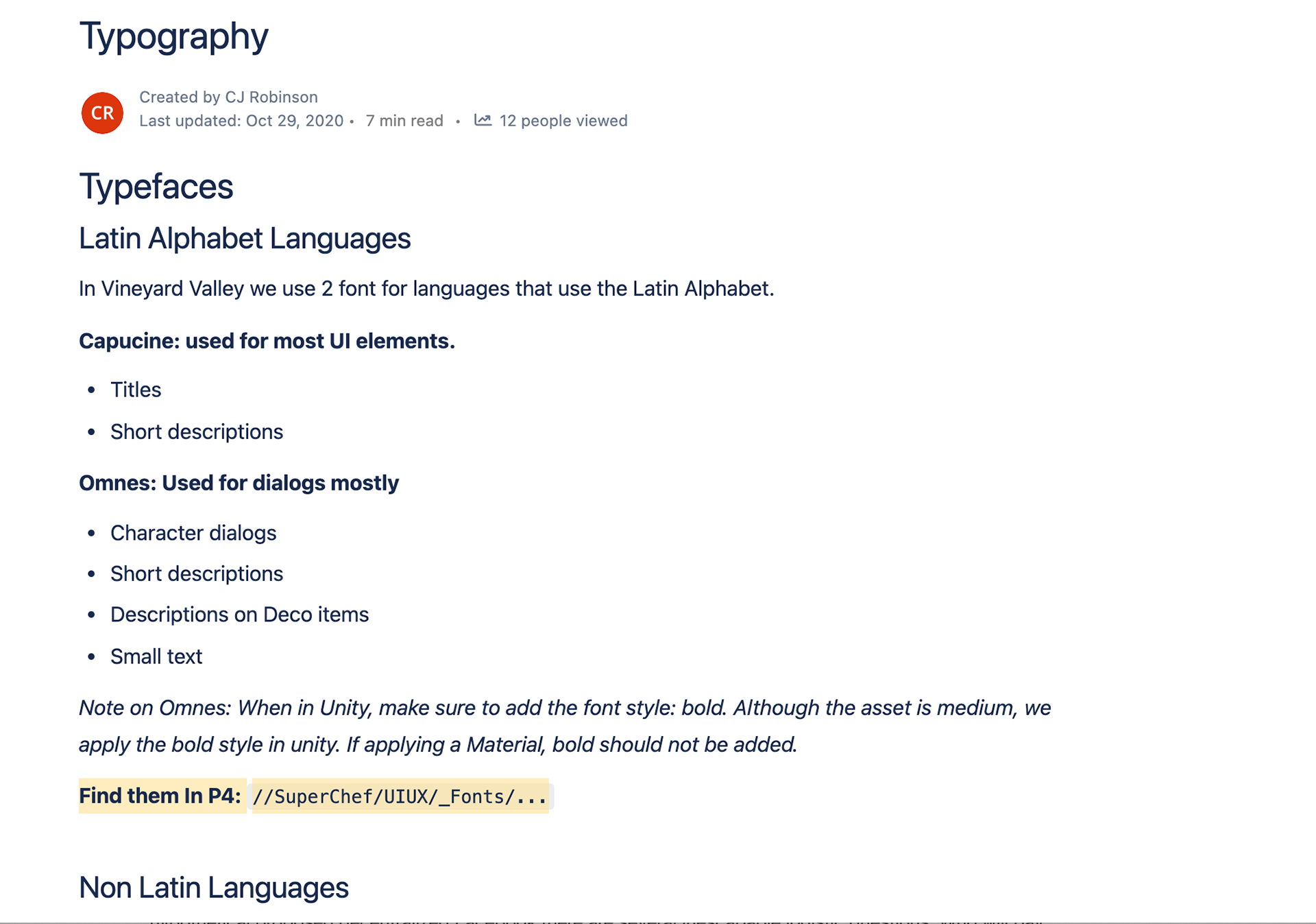
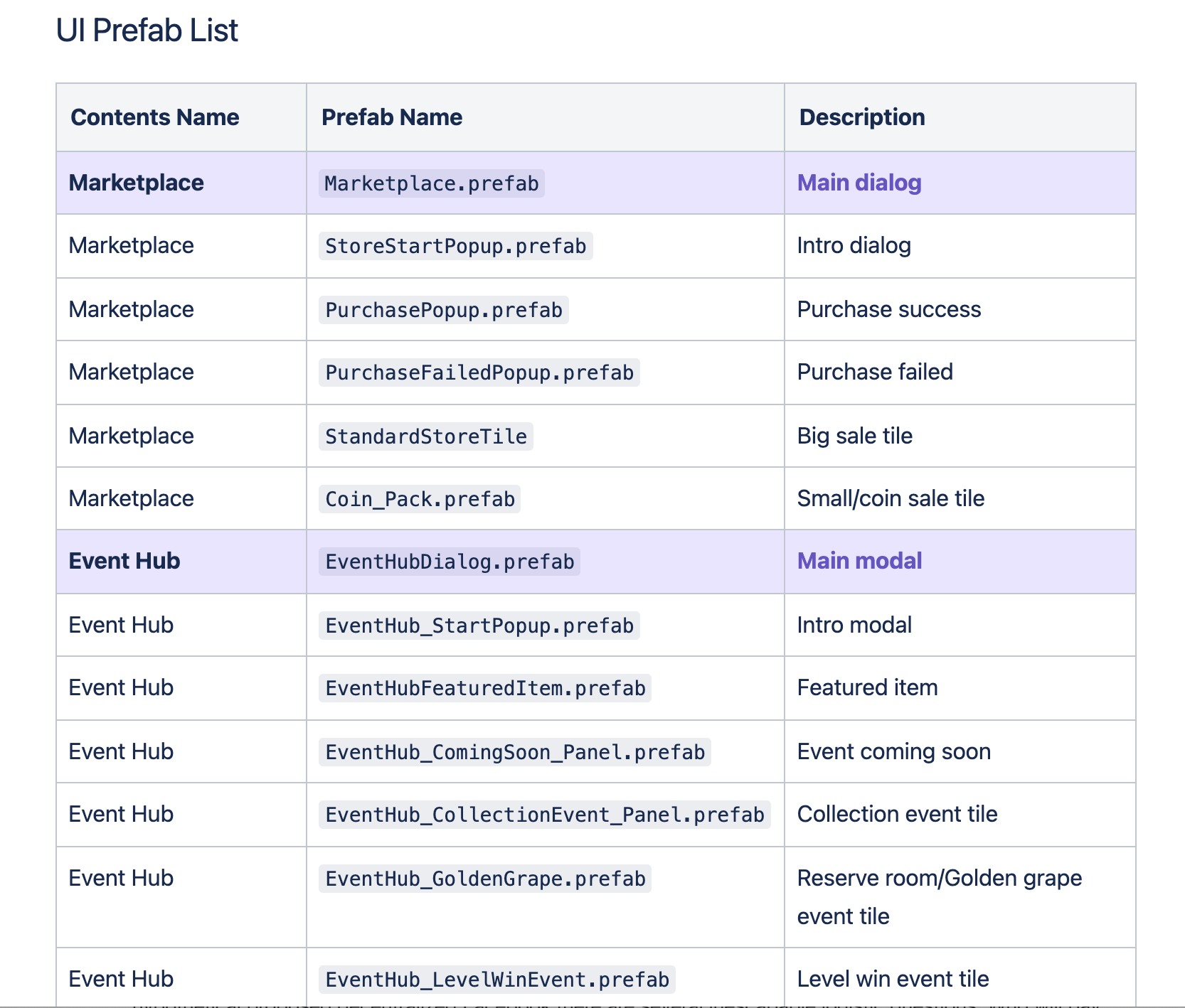
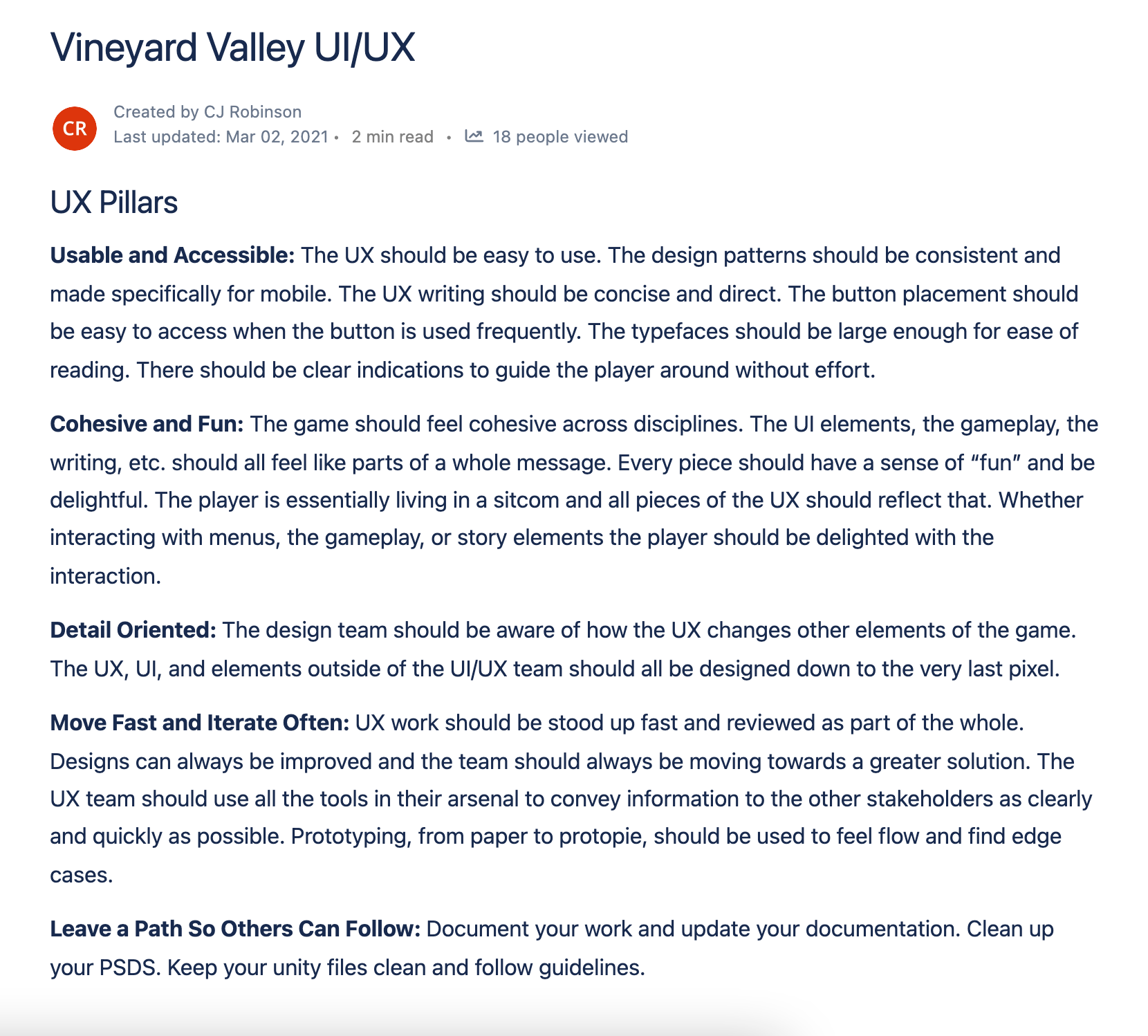
Snippets of some of the Information on the Vineyard Valley UX/UI Confluence page that I put together.
Creating an Informational Hub and Design Systems
While the project was already live when I joined the team, up until that point there had been very little processes on the team. There were only two UX designers at the time and much of the information was passed directly between the two. This meant that there was no insight from other team into the UX team's process or documentation, nor was it easy to find old documentation that could be relevant.
There were also no UX Pillars to refer back to and make sure our designs continued to be aligned with the Game Pillars. In order to fix these issues I created a Confluence page to house all the UX Documentation. This included general informational docs, systematic documentation, feature specific, etc.
I wrote Design Pillars, Typographic rules, Prefab lists, etc. I also made sure that we had some Design systems in place things for features that could be grouped, such as Events.
Take Away
Overall this endeavor saved us many hours and made it much easier for QA, animation, etc. to find what they needed from us without needing to ping us directly. Game Design and UX also worked together to create a unified doc, instead of two separate docs. This saved time for the developers and QA because they wouldn't need to double check two places for information.
For the Post Mortem for the Vineyard Valley SF team, the UX team was called out as being the best team to work with.
For the Post Mortem for the Vineyard Valley SF team, the UX team was called out as being the best team to work with.
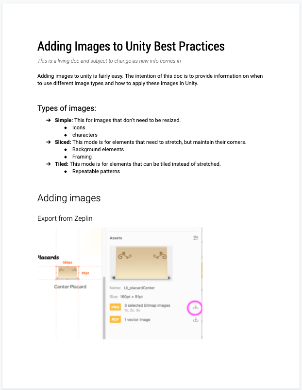
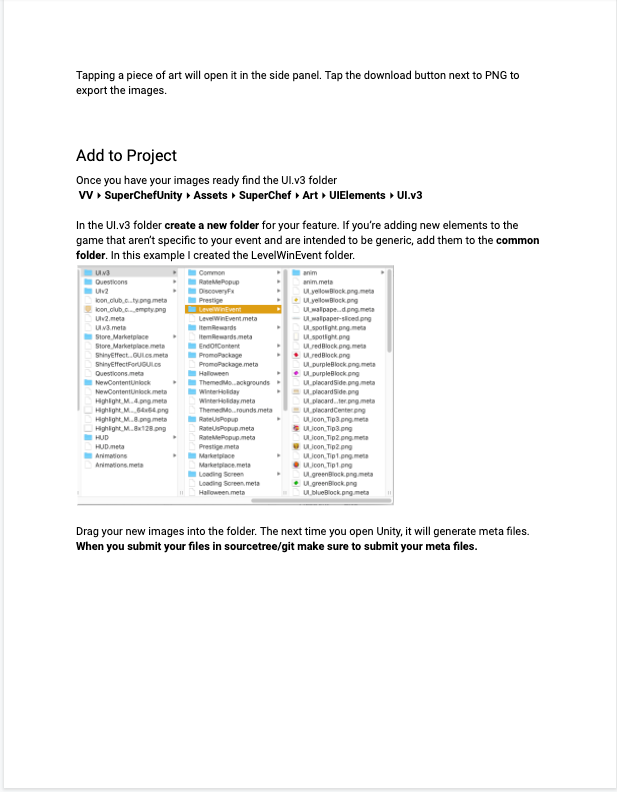
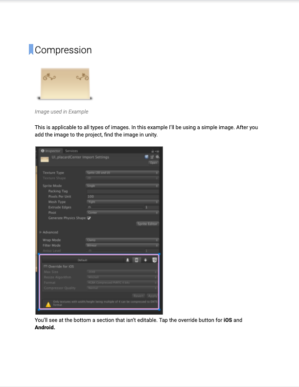
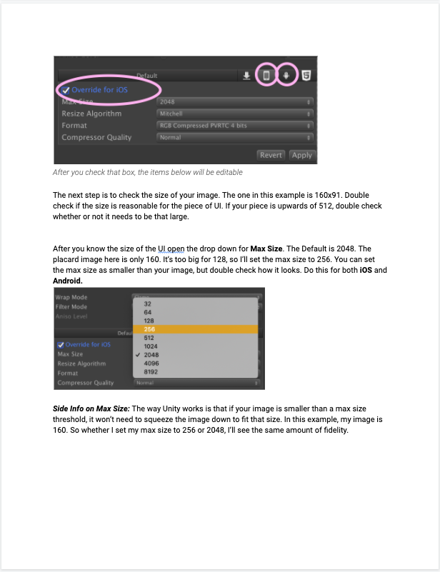
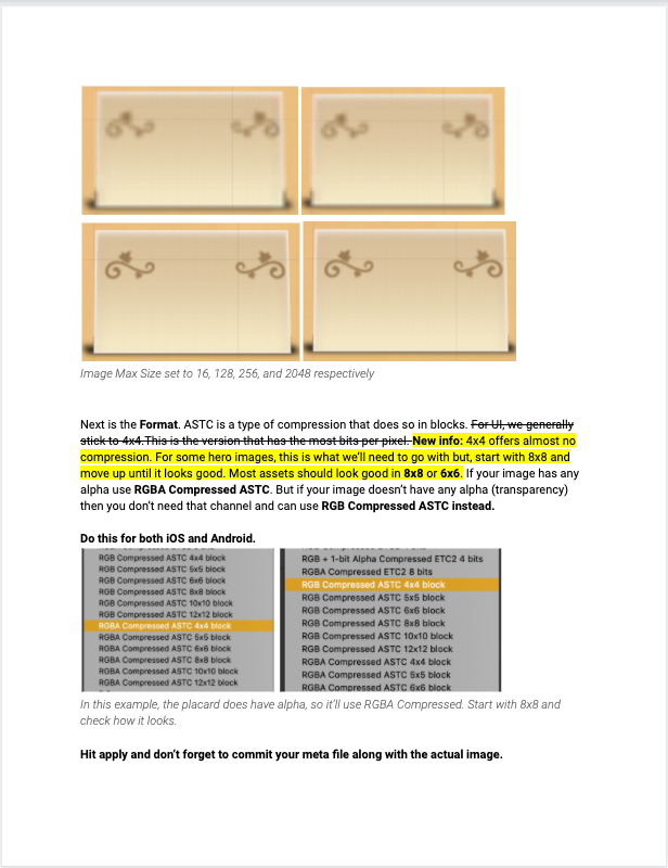
Snippet of a document I wrote to onboard UI Artists to adding images into Unity. This document is now used on several teams
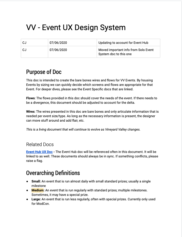
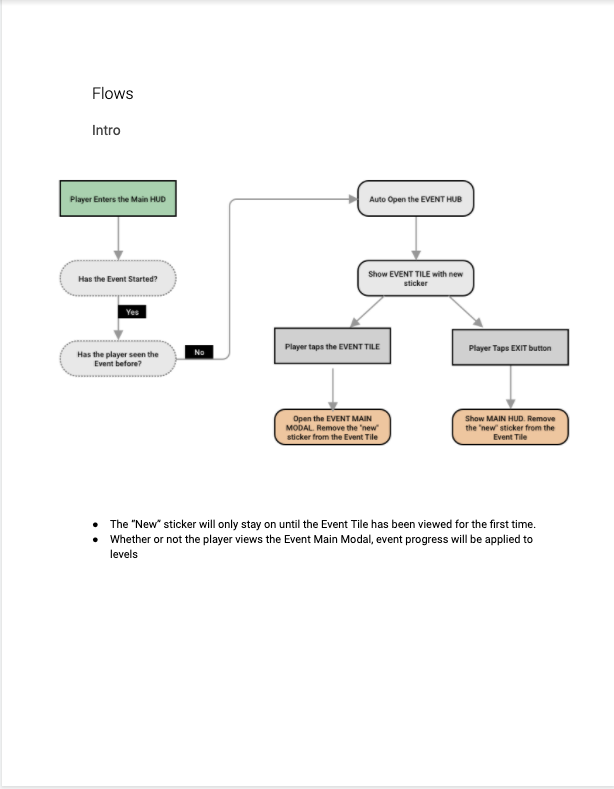
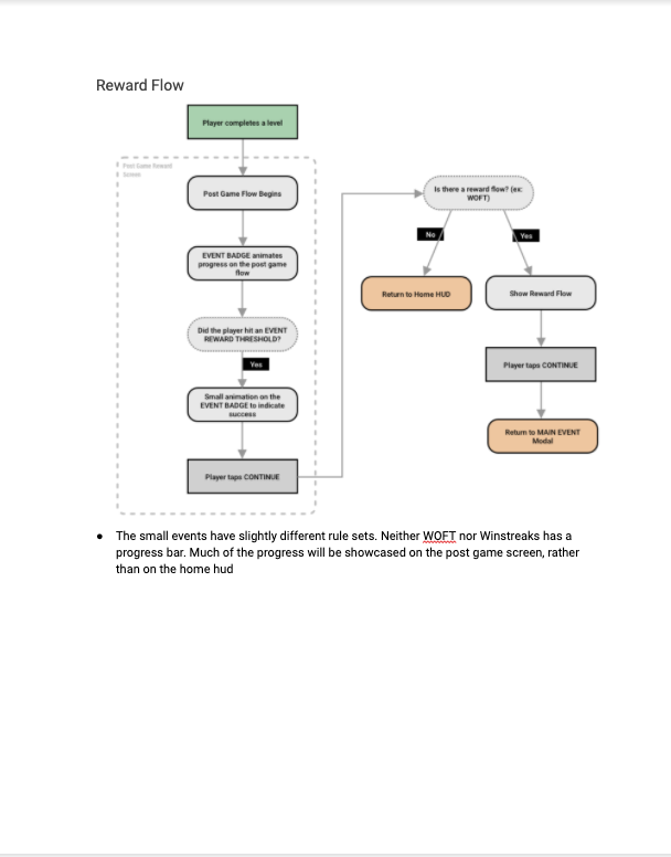
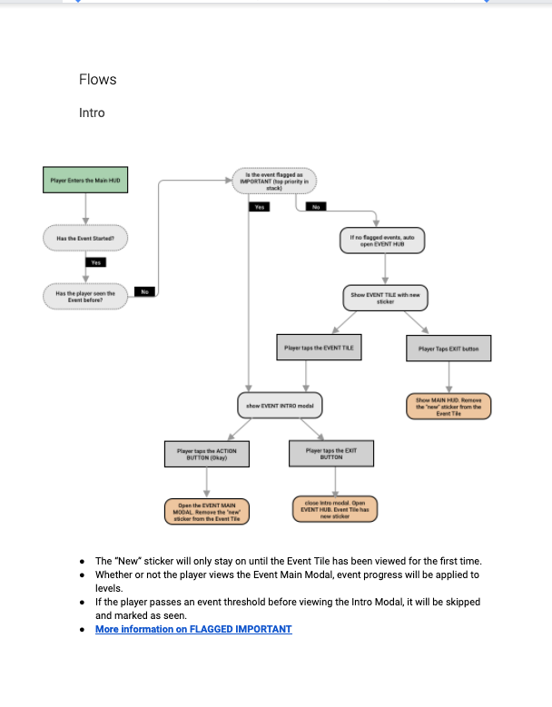
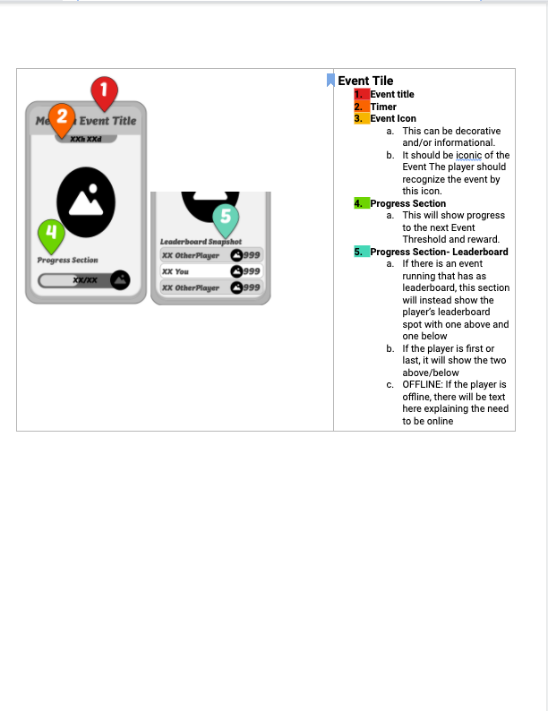
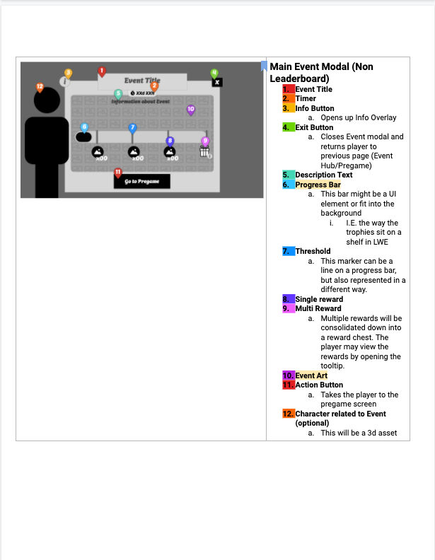
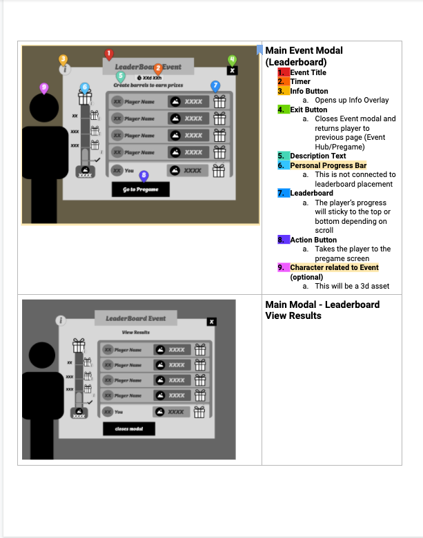
Snippet of a Systems Document that I wrote to house all our Events. Each event added would be assigned a size by design and then the correct flows would be applied. This prevented one-off Event issues.