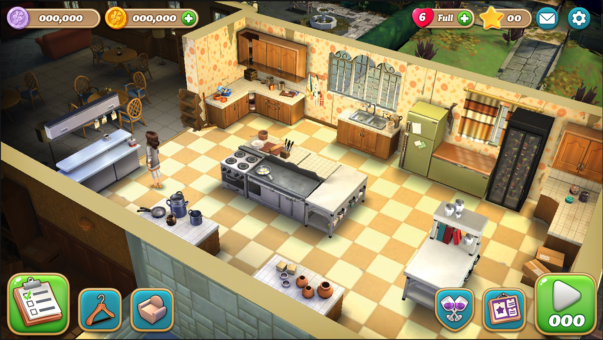
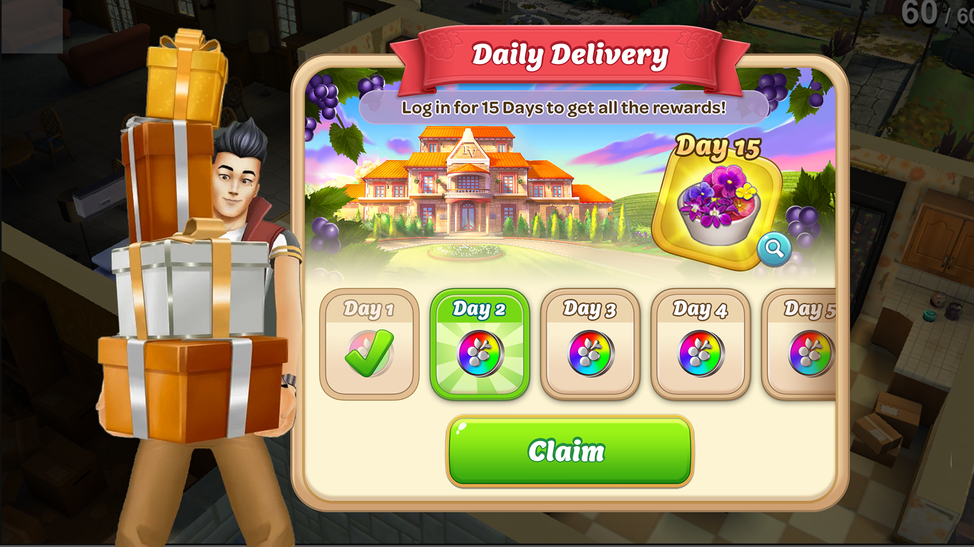
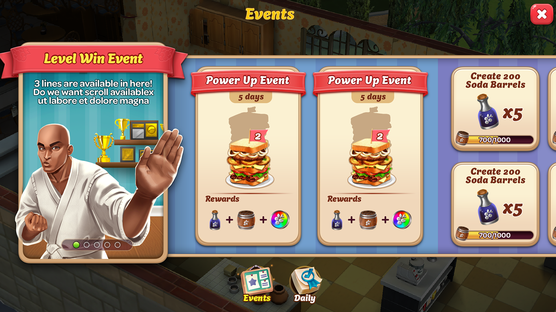
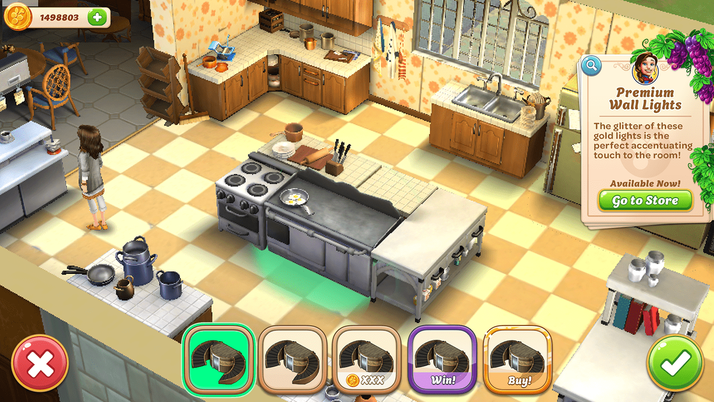
Vineyard Valley
This game also had an established style when I came on. The game initially had a cooking theming to it, so many of t the icons and theming felt kitchen-y. That concept switched to a general "vineyard" vibe, but the UI art didn't have a chance to be updated. So while on the team, I directed a revamp of the Home HUD. I also worked to establish a color guide and tone for the game.
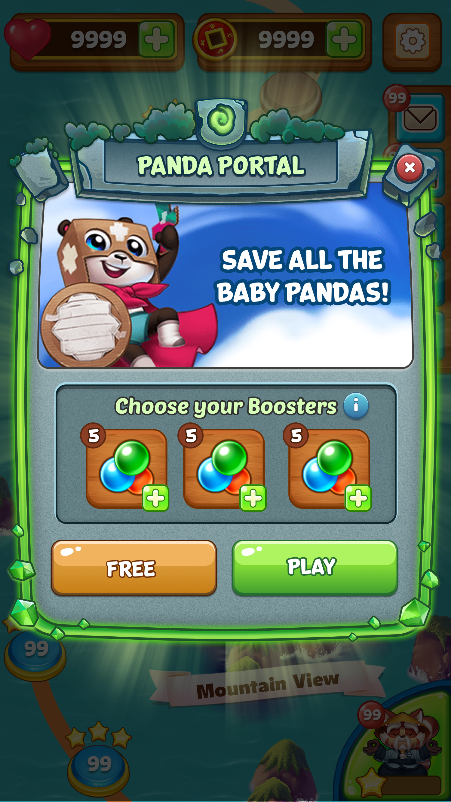
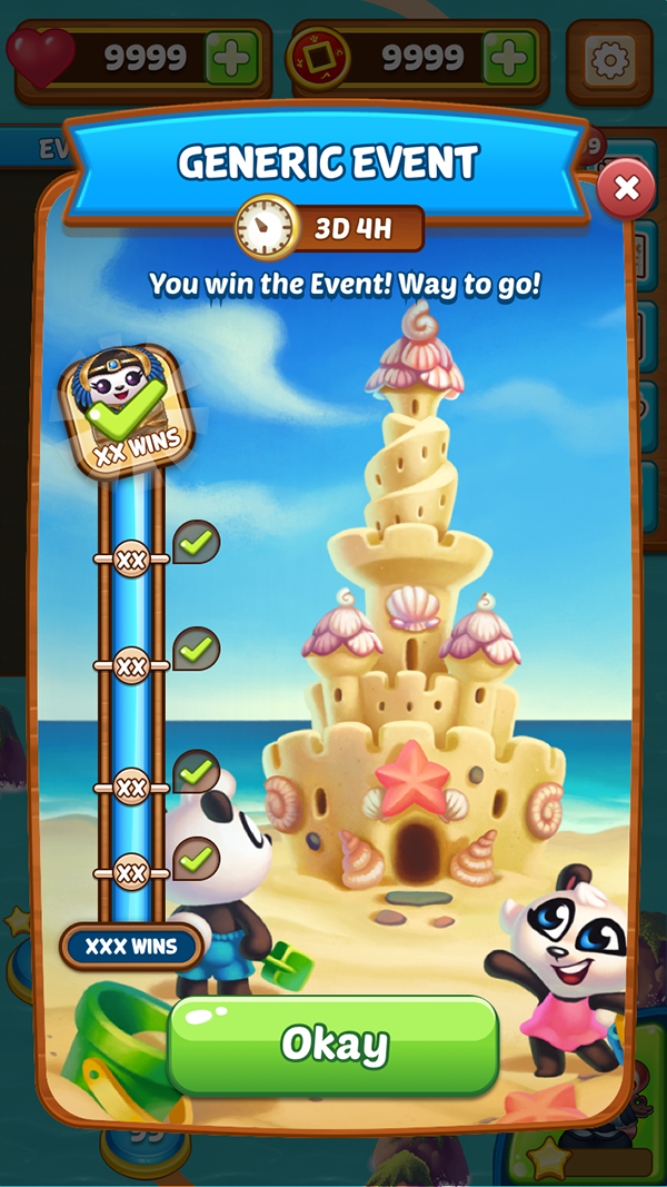
Panda Pop
When I came onto Panda Pop, it already had an established style. This style was quite dated, so I worked to update it by straightening out the sides of the modals, adding some gloss to the buttons, and scaling the wood texture so it created less visual noise.
I also had the opportunity to create Panda Portal's UI. It skinned the old UX, but with a new header and stone texture.
Tome: Immortal Arena
The project was already underway when I came onto the project. It was vital that I could match the existing style and expand upon it. The look was highly skeuomorphic and detailed, which presented a fun challenge. All assets I created were vector with styles applied, so they could be easily scaled and adjusted.
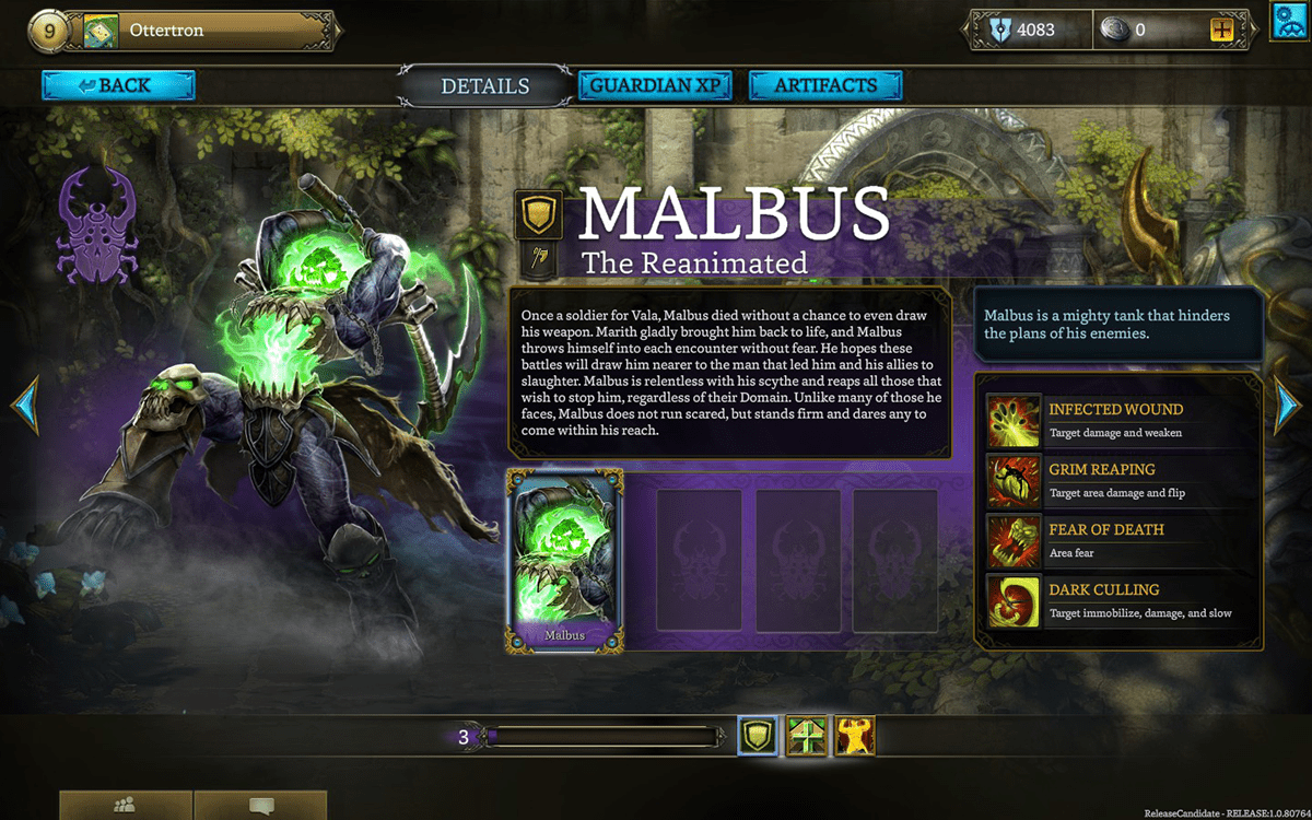
Oh this page I worked on the information section. Some of the filigrees were created by other artist and I simply utilized. However, I did the banner next to the Character name, as well as the arrow buttons, and corner details on the portrait.
Close up of some of my work on the Character Info page. All of the UI work (other than icons) was done using vectors and layer styles. I wanted to make sure that everything was easily scalable without losing any fidelity.
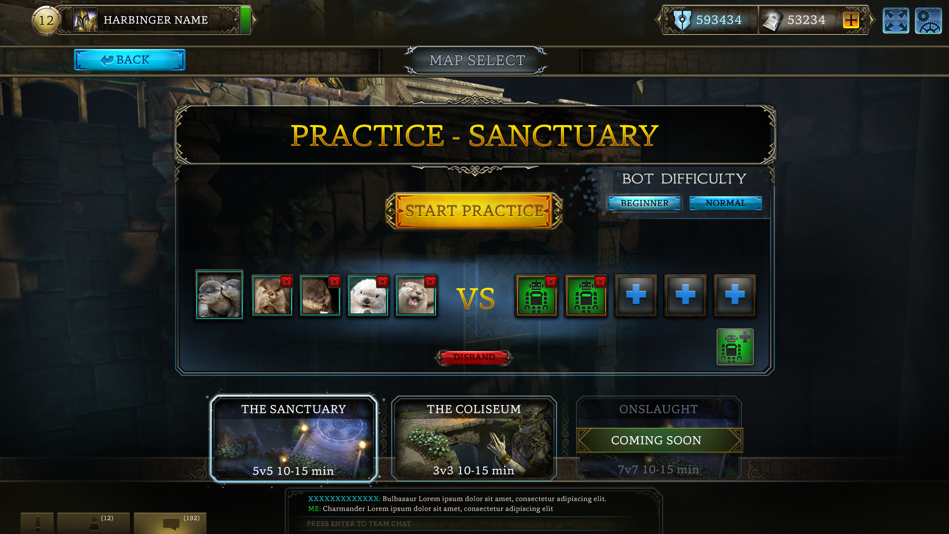
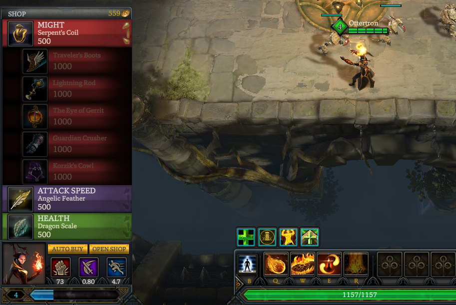
I worked on the portraits, the bot difficulty section, and the framing for the map select.
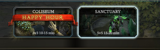
A close up of the Happy Hour banner I made. Once again, this was done using vector shapes and layer styles in photoshop.
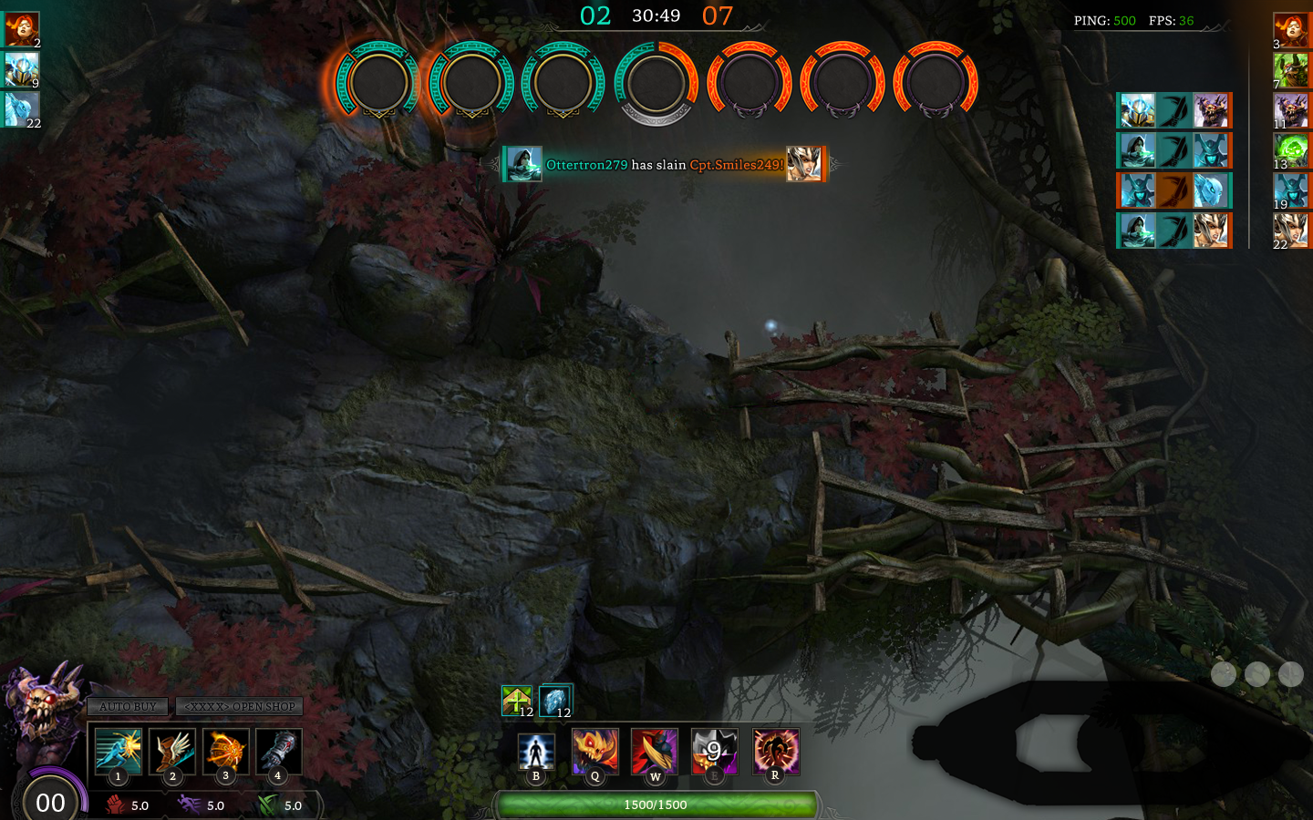
This page was a WIP for a new large game mode. I also explored redoing the bottom section to create a better visual hierarchy. All UI on this page was done by me.
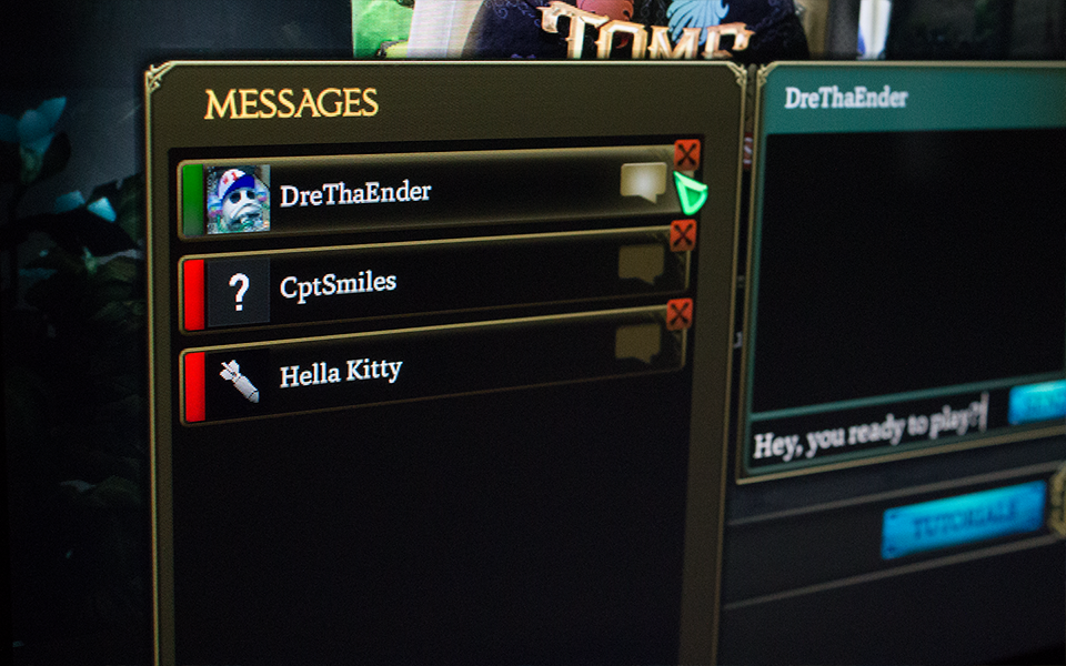
A close up of the chat UI that I created.
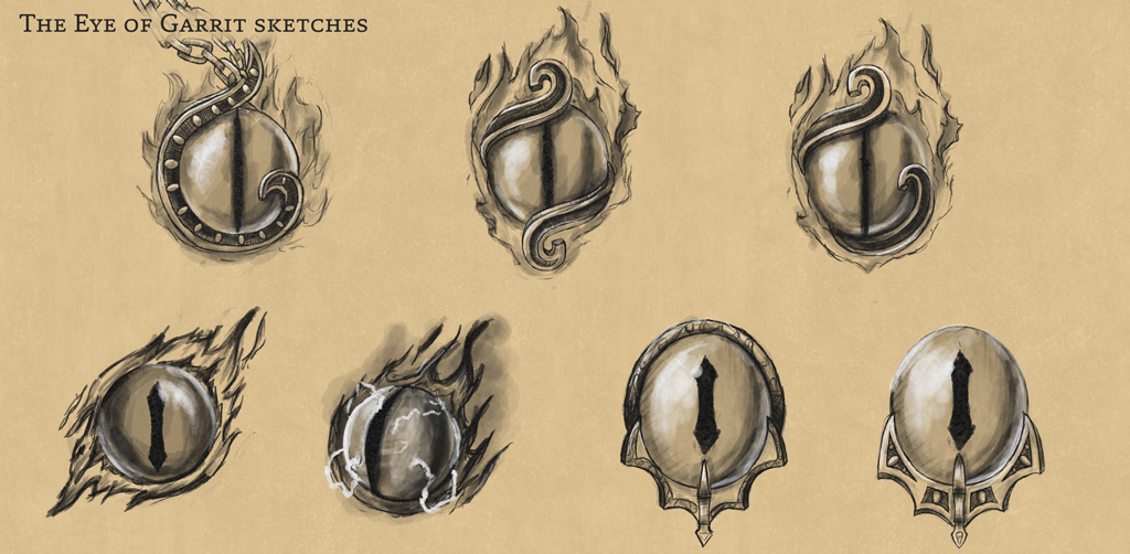
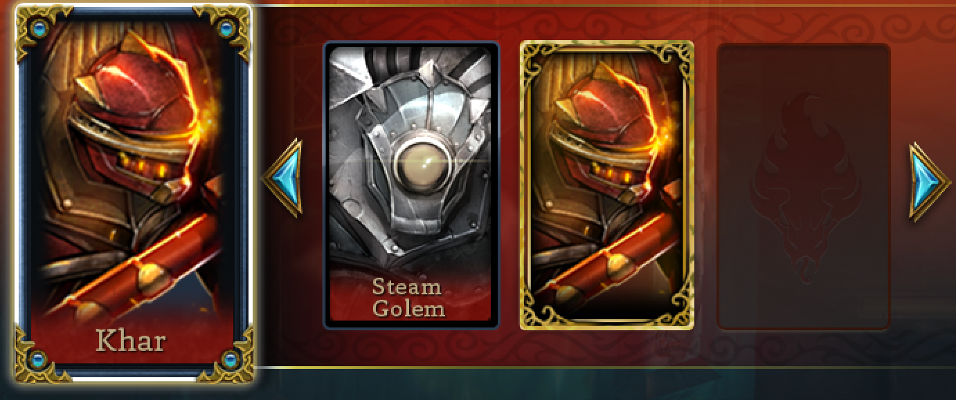
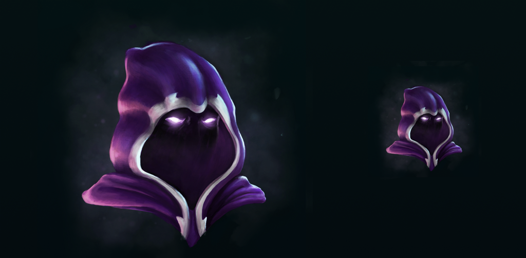
Sketches for one of the in game items that I made. I showed these to my UI Lead, who selected one and then I rendered that out.
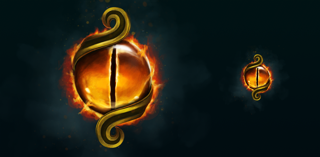
My final render of the Eye of Gerrit
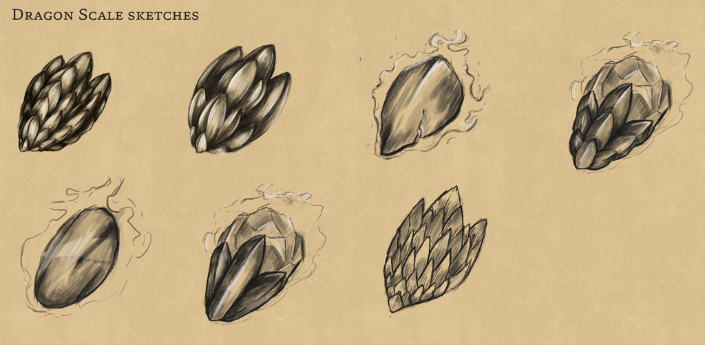
My sketches for the in game items, Dragon Scale
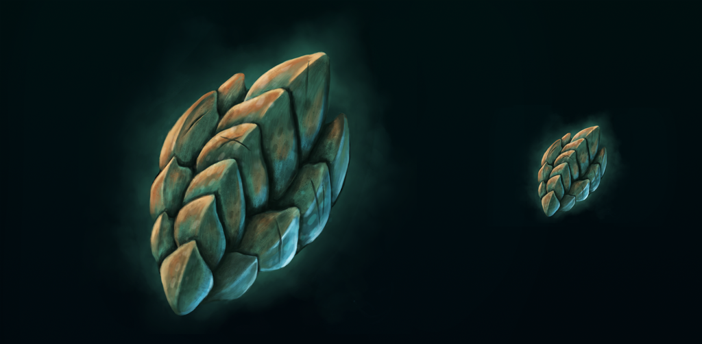
My final render of Dragon Scale
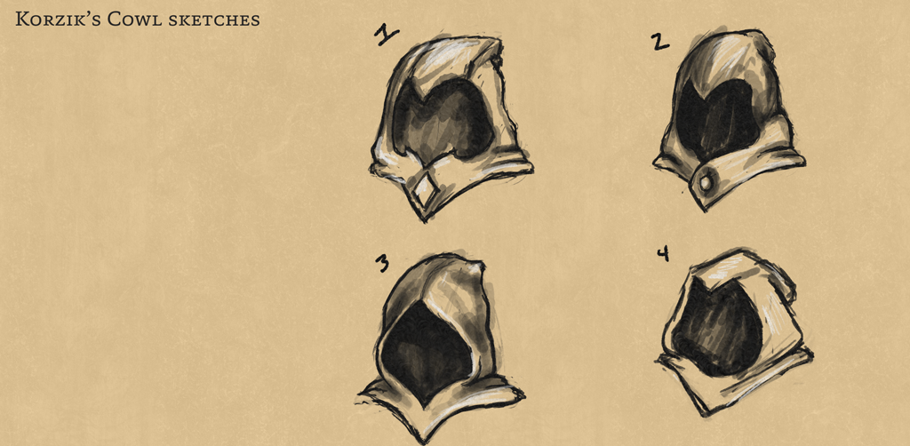
My sketches for the in game item, Korzik's Cowl
My final render for Korzik's Cowl
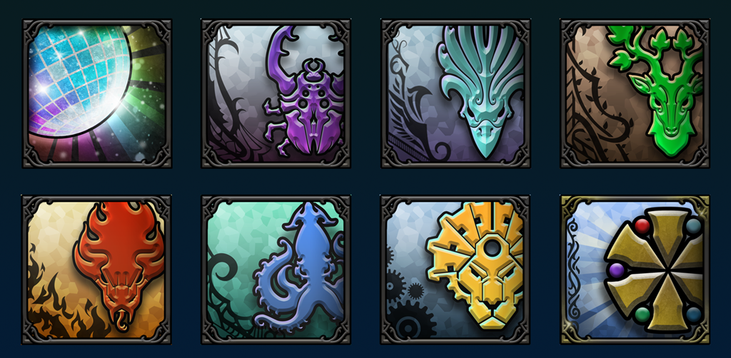
Showcasing some of the in game items I worked on. You can see The Eye of Gerrit, Korzik's Cowl, and the Dragon Scale
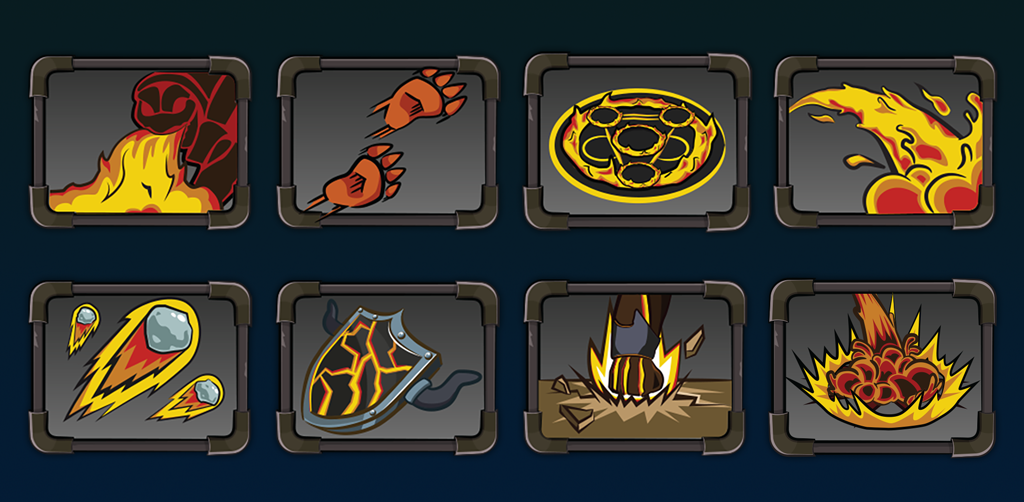
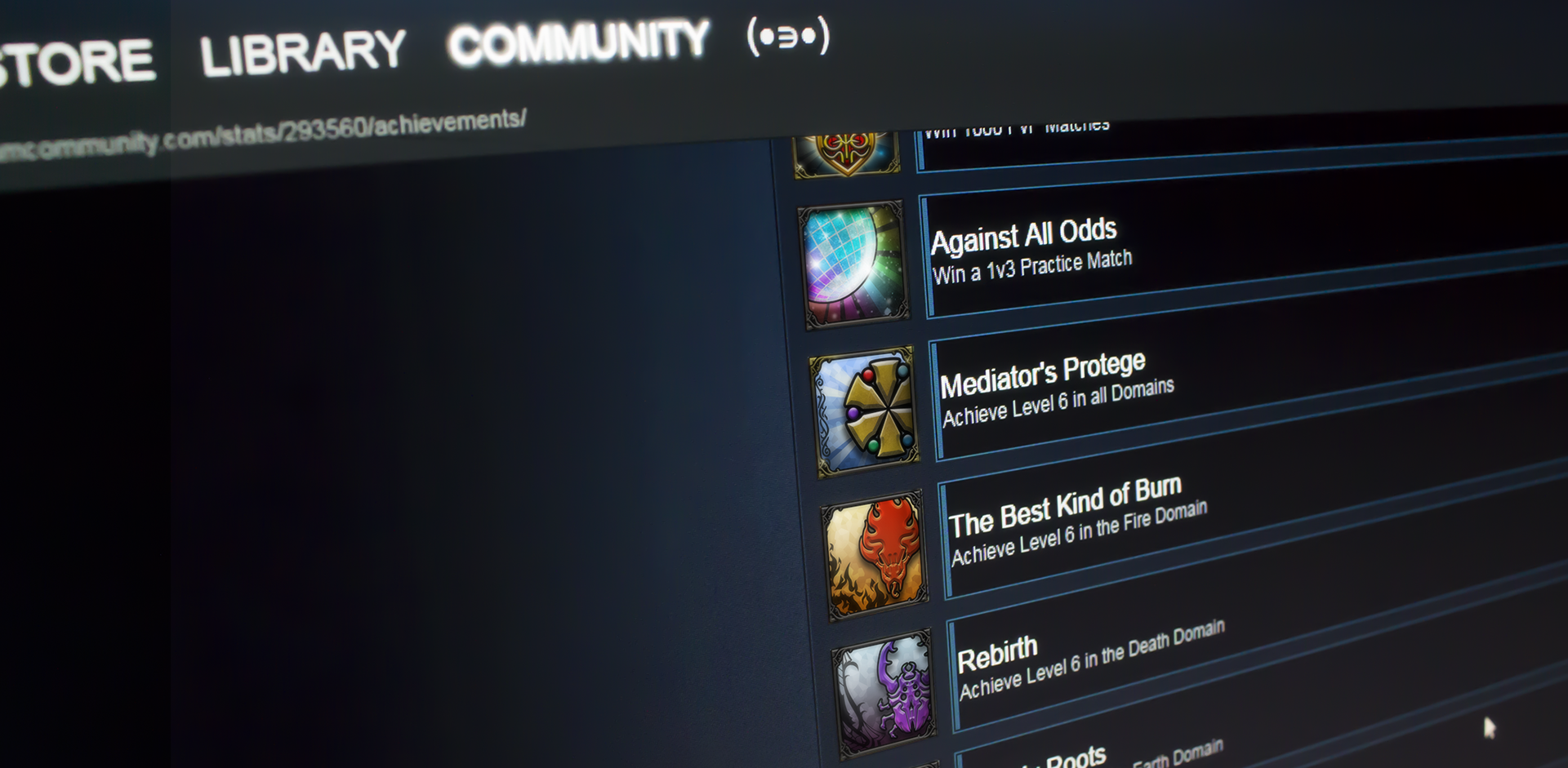
Sketches for the Steam Achievements I worked on
My final renders for the Steam Achievements I worked on
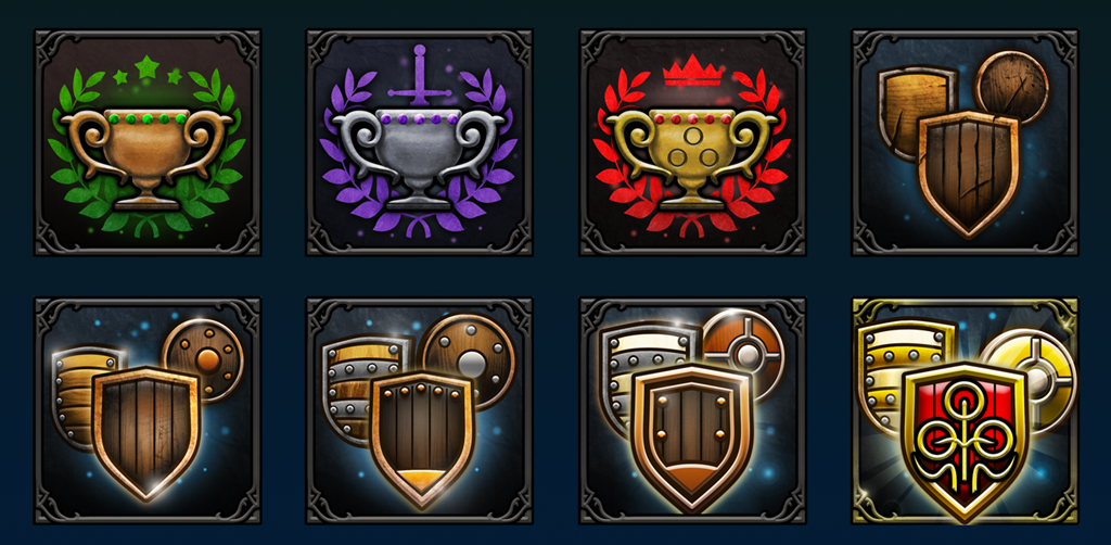
My final renders for the Steam Achievements I worked on
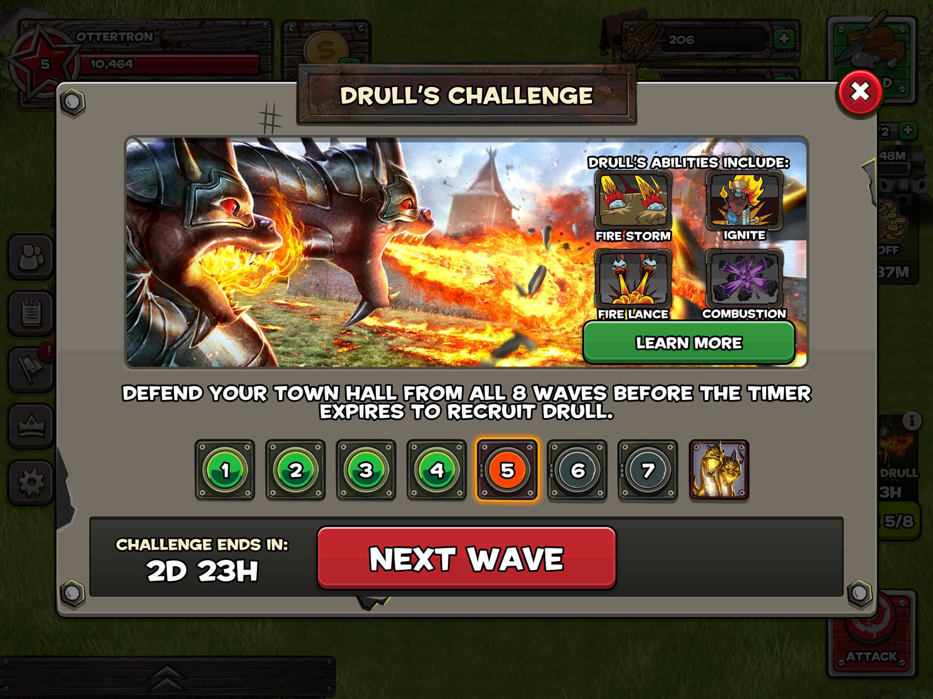
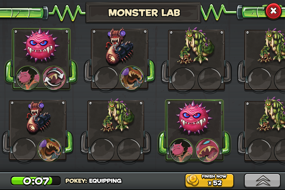
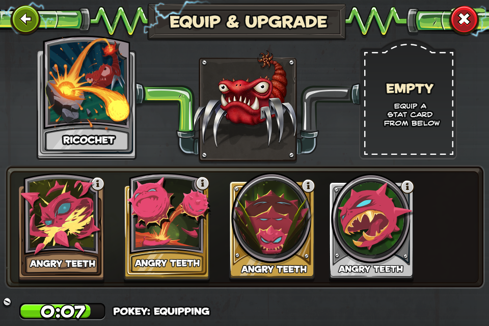
Backyard Monsters: Unleashed
The art style sat somewhere between cartoony, edgy, and cutesy. The original
Backyard Monsters was a hodge-podge and lacked in visual consistency. During my time on the project I worked hard to slowly move the art style towards a consistent direction. I leaned into the edgy cartoonish vibe and began to explore a more vibrant style. Sources of inspiration included early Teenage Mutant Ninja Turtles, 90’s toys, and metals.
The assets I inherited in the game were also very size intensive. I began to drop those out in favor of smaller assets that could be patterned, or 9-sliced.