KIXEYE's War Commander: Rogue Assault
Role: User Experience Designer
Time: 2 Years (2016-2017)
Platform: Mobile
Engine: Unity
War Commander Rogue Assault (WCRA) is an RTS mobile game running on Unity. The game boasts a healthy sized community, intense PvP battles, a large world map, and many other features. The game was in production for around three years and has been live for over two.
My Responsibilities:
•Work with Game Design and Product to create cohesive features
•Create User Stories, Flowcharts, Wireframes, and Prototypes
•Implement in Unity
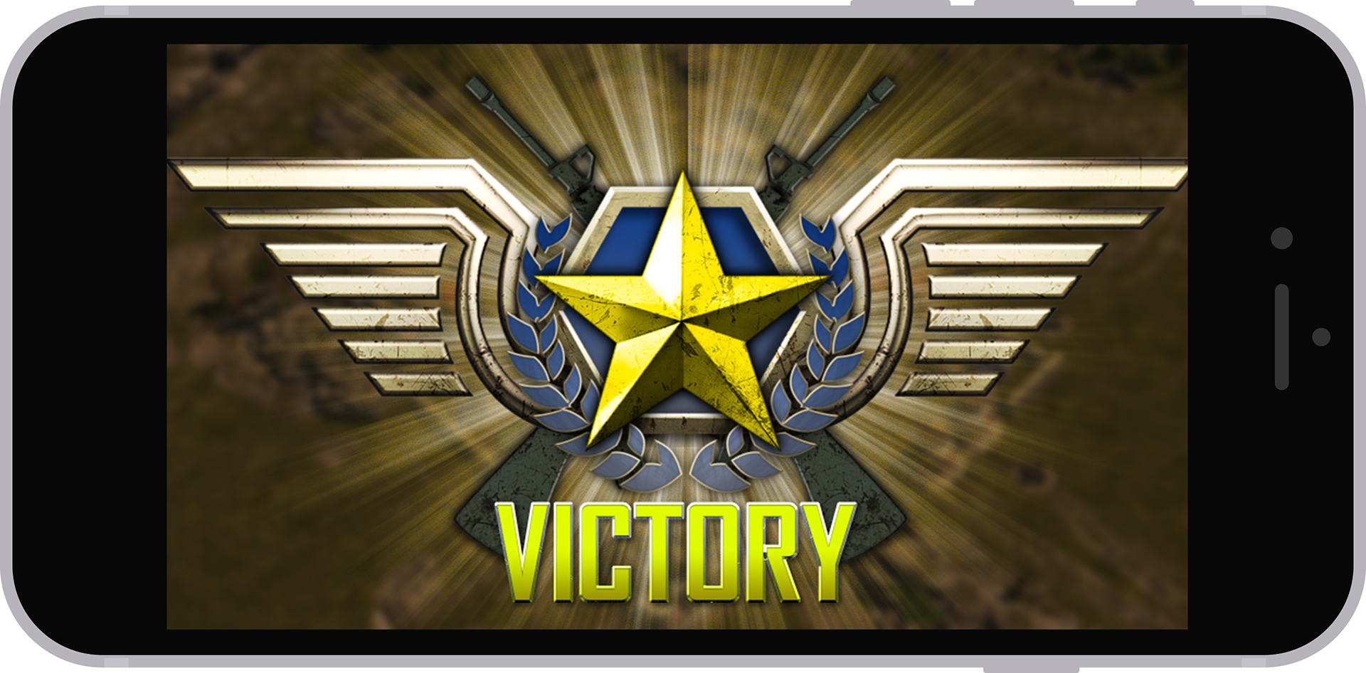
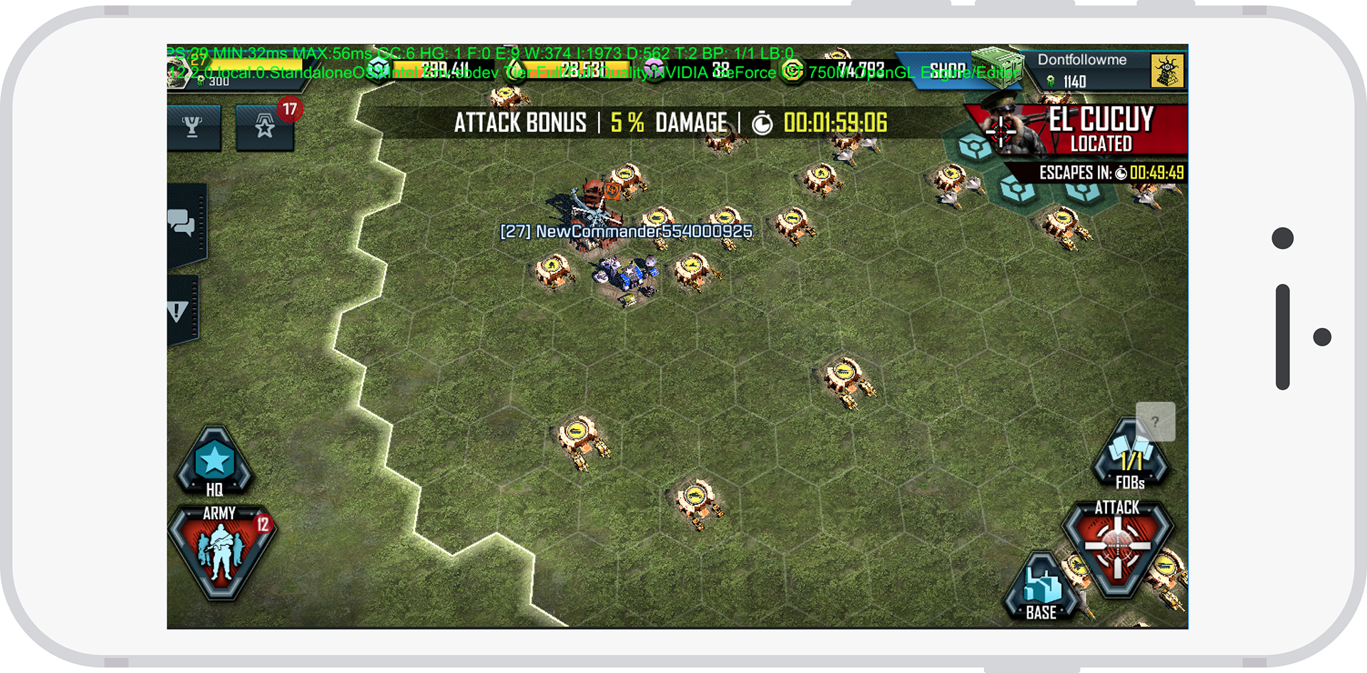
Victory animation that I made in Unity
Product Goals
•Fill in a gap on the mobile market for mid-core to hard-core gamers.
•Tie in to WCRA’s predecessor, War Commander
Audience
•Mid-core to hard-core gamers
•Existing War Commander player.
Design Challenges
•Integrating with a two year old team
•Creating new intricate systems UX
•Refining old systems UX
My Role
When I started on the team, I was brought on as a hybrid UI/UX Designer. I created and implemented art and animations into Unity. As the game matured and eventually released, I shifted to be more UX than UI.
I was responsible for the New User Experience flows, launched features, proposed features, and a whole myriad of things. Due to the size of the project, I will go over my UX process rather than focusing on a specific feature.
Research & Early Iterations
When starting any feature, whether it be an entirely new feature or an iteration
of an old one, research came first. I would look at games, apps, movies, any direction I felt could be applicable. I don’t believe that a game has to pull only from games
research. There’s a lot to be learned from other media sources or systems. I generally like to write a paper to share around with other designers and the stakeholders.
After I had a solid direction, I would begin writing my flows and rough wires. At this point I would show my flows and wires off the game designers, product, the dev team, pretty much anyone I could. Collaboration is important to create successful products.
Flow diagrams are important for taking a step back and looking at the whole project. This process allowed me and the stakeholders to assess scope and viability.
Early flow for a New User Experience
Simple wire and flow for the Supercharge feature
Detailed Wiring and Prototyping
After verifying the design directions, I would begin creation of detailed wires. These evolved into simple prototypes, and eventually more complex prototypes. The game designer and I would work closely to ensure the correct information was being
surfaced.
Due to the nature of the features, it was important to capture as many edge cases early on as I could.
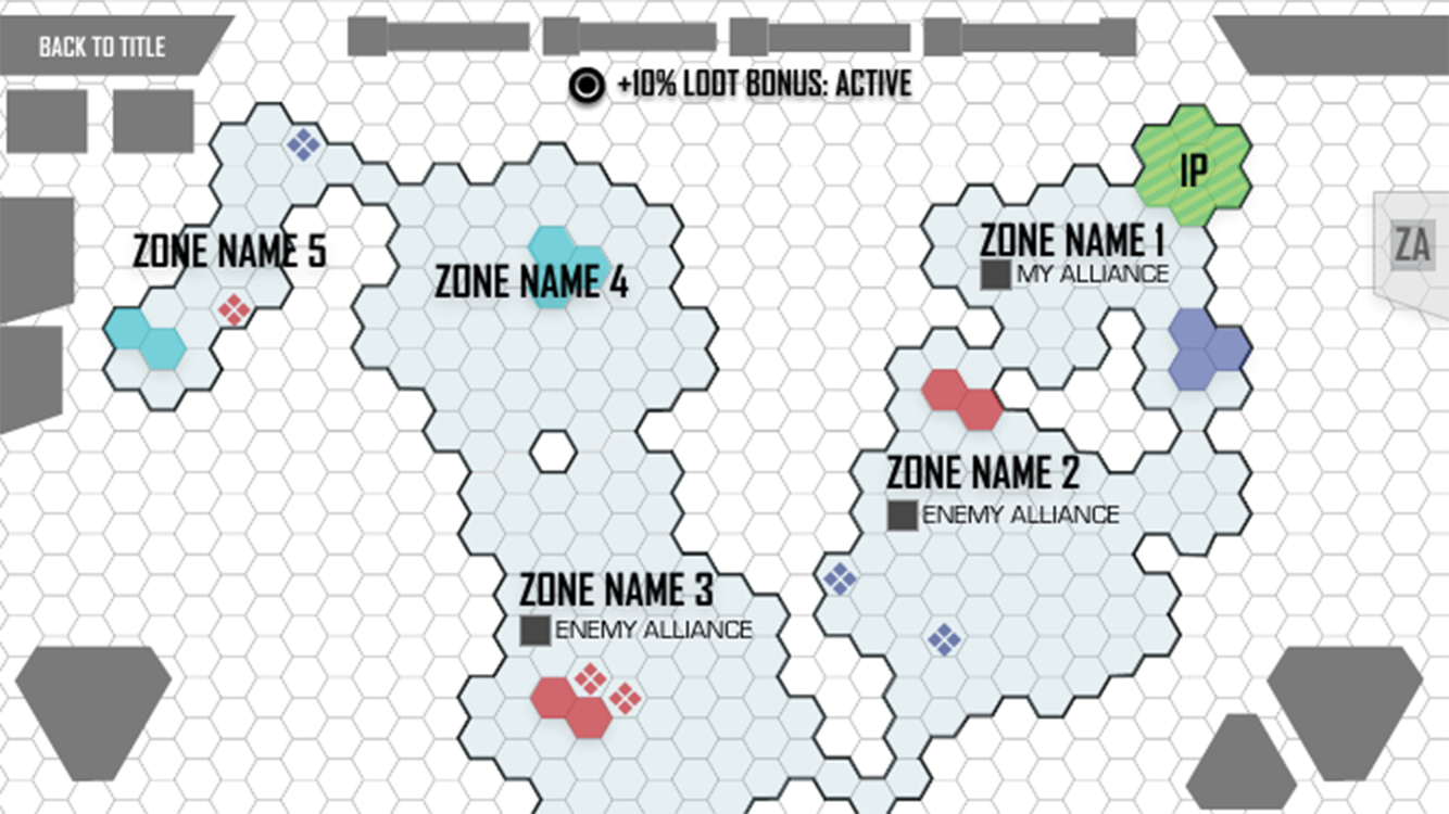
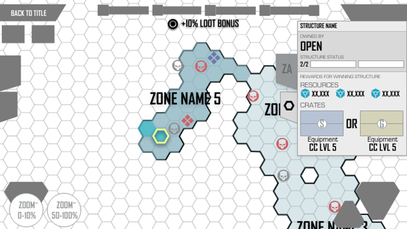
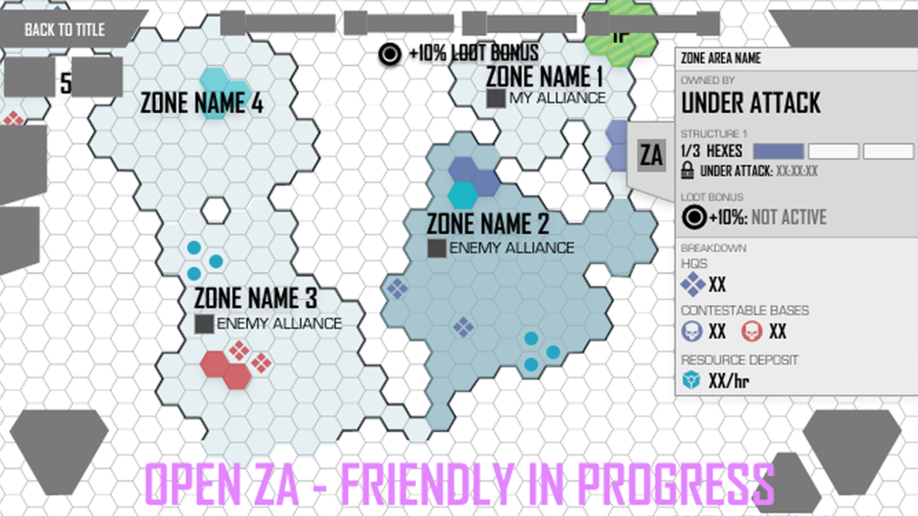
A selection of states from the Alliance World Map Feature click-through prototype
A small shot of various screen states used in the Chat Feature click-through prototype
Moving Fast and Iterating Often
WCRA was a fast paced environment. It was extremely important to stand up wires quickly and prototype. I often went through a slew of revisions before we found the best design possible. Game design, devs, and I would bounce off each other until we found a path forward for all of us.
Often while working with game design, we’d be moving at the same time. I had to be flexible with my iteration and balance their desires while advocating for the player and player experience.
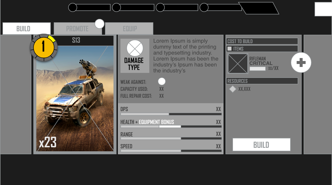
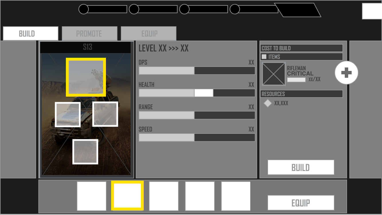
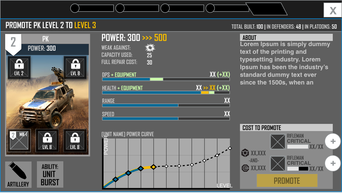
The build and upgrade screens went through many layout iterations. Layout and UX was done by me. UI was done by David Wright.
The Importance of Motion
As with all projects, my job didn’t stop with images. Motion is a huge part of player enjoyment and understanding. They need to be rewarded in the right places. Motion has to feel smooth, integral, and delightful.
I would begin to think about how motion could play into the feature early on with rough prototypes. Once my work had been approved, I would follow with well timed After Effects prototypes. Pacing is hugely important for clear understanding.
After these had been refined by the UI Artist, I would implement the actual animation in Unity using the timeline feature.
Project Take Aways
During my time on WCRA, I had the opportunity to create designs for vast game
systems. Providing the audience with the correct amount of information on these
systems was an intricate balance. It was really important to consider the audience type for every decision made. What might appeal to a casual gamer, would be
boring for a mid-core gamer.
This game also gave me an opportunity to really sink my teeth into Unity. I had some previous experience, but learned a lot on this project.