Anki’s Overdrive
Role: User Experience Designer
Time: 4 Months (2017)
Overdrive is a slot car game based in robotics. Each car knows where it is on the track and knows the location of enemy cars. The player can customize their weapons and power ups. The game has various modes, allowing for many different play styles. The player controls their car from the app.
Applied Work
I was not on the Overdrive project for very long before it was sunset and the team was moved to different projects at Anki. One of the tasks I took on was to analyze the experience as a newcomer. Did the experience make sense? How could it be improved? The Overdrive Team wasn’t interested in a complete re-haul of the app, but there were some small tweaks to be made that could smooth out the experience.

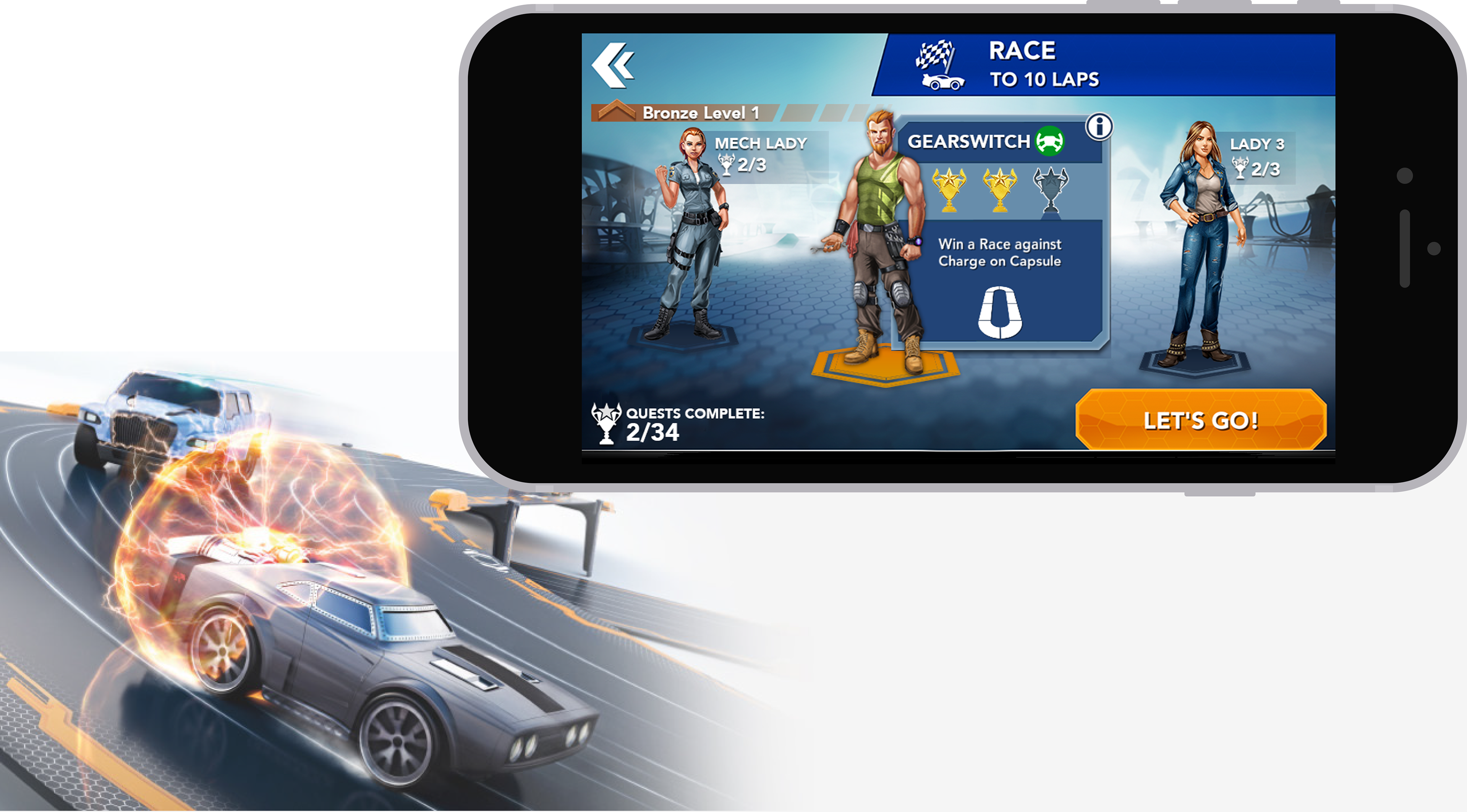
Some of the small adjustments I made to the live game
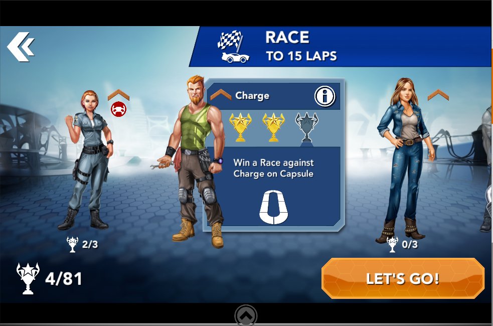
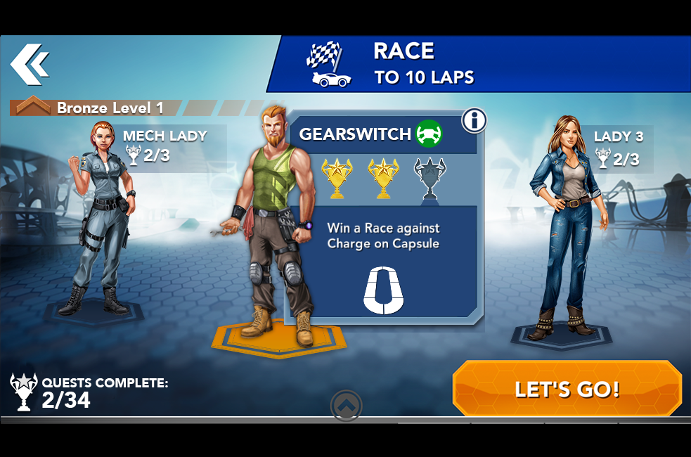
Small Adjustments Yield Big Improvements
In this example, I added a few small elements in order to make the page more clear.
• Added Platform: This kept the characters from feeling as if they were floating in space. It made it more clear who was selected and grabbed attention.
• Defined icons: The Bronze Chevron encompassed all these characters and was a level. By adding text, it became much more clear. Quests felt confusing as well. Was that the number I had completed or had left? Adding text removed any doubt.
• Regrouped Content: These characters are referred to elsewhere in the game for daily challenges and other events, so it was important to move their names outside the collapsible selection, so the player could pick the right opponent at a glance. The information on the previous iteration was also fairly scattered, so I grouped it. Players shouldn’t have to search around for information.
After these changes were approved by my Art Lead, I broke out my created assets and applied the changes in Unity.