Anki's Vector
Table of Contents
•ONBOARDING FEATURE
Onboarding Feature
I was the UX Designer and Product Owner for Onboarding. This feature took the combination of many teams. I worked closely with Robotics, Product, App Engineers, Animation, User Testing, and many more people to create this feature. It was a multi-layered problem space that provided a unique and interesting design space.
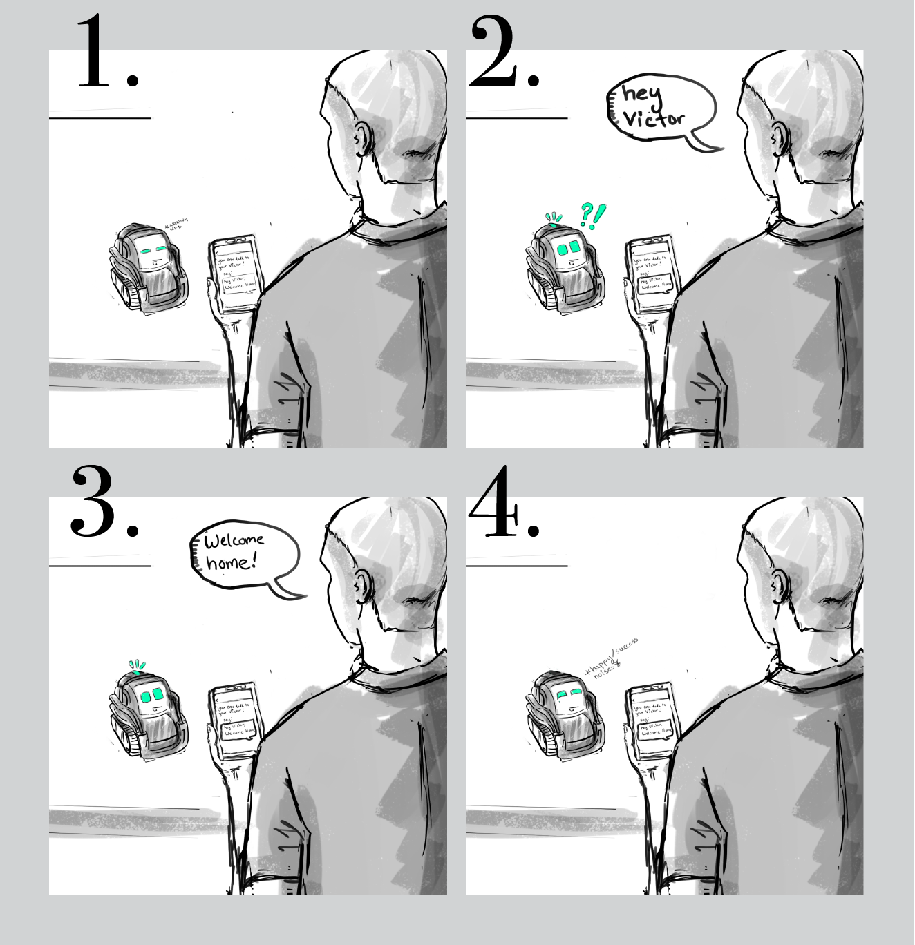
A few snapshots of early Onboarding storyboards I drew
Onboarding Goals
When I started designing Onboarding, I was sure of a few things:
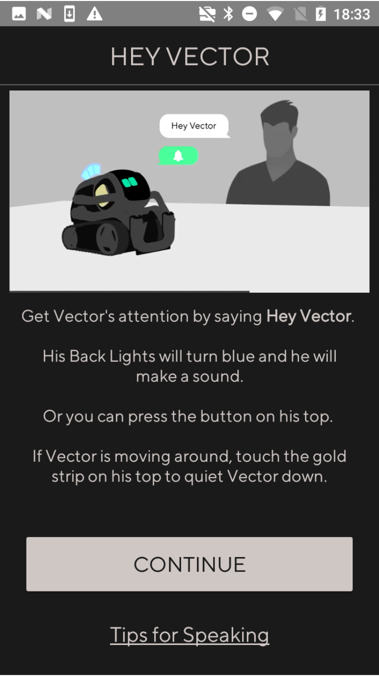
1. Onboarding needed to teach the user how to trigger Vector
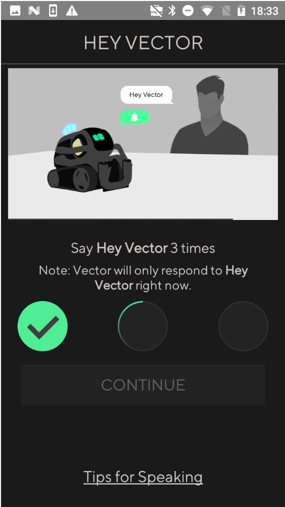
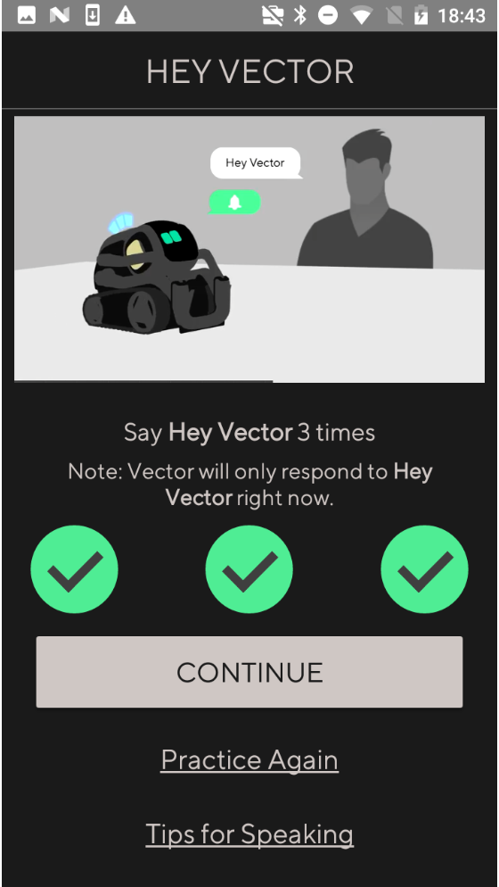
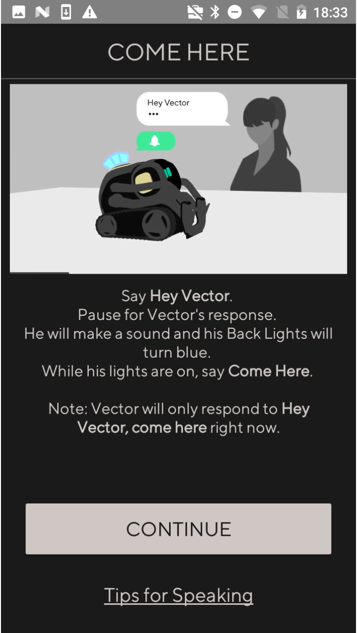
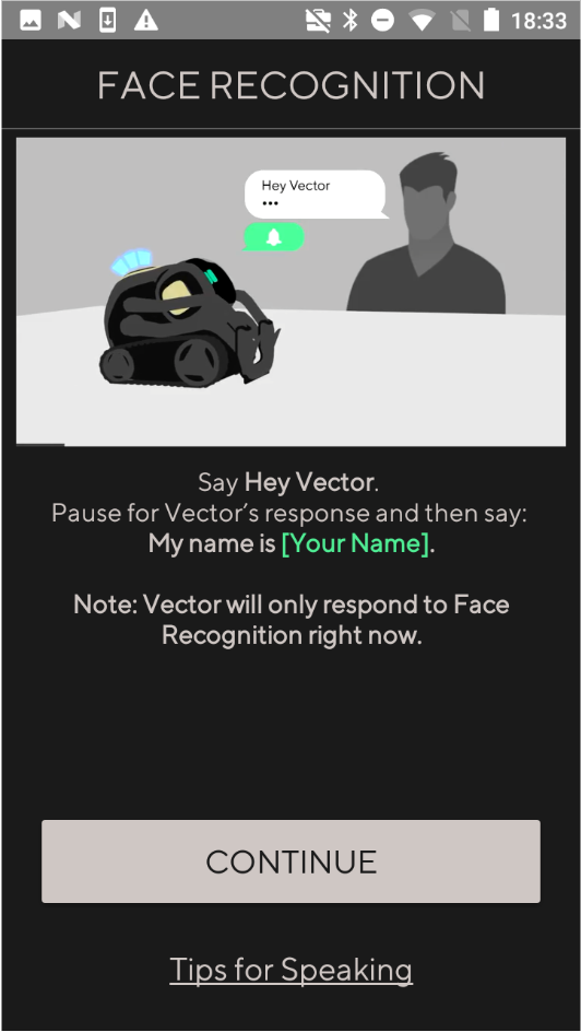
2. There would need to be at least one full Voice Command
3. It had to be delightful
Onboarding Challenges
One of the biggest Onboarding challenges was attention splitting. We were trying to teach the user how to interact with the robot, so the app was needed as a guidance tool. However, this caused the user to shift their attention between the app and the robot.
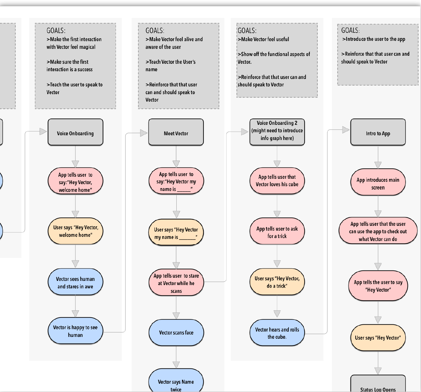
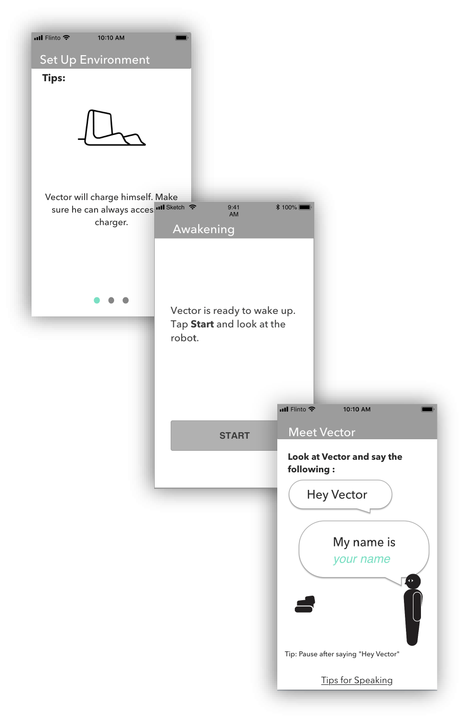
Flow Diagram and a few select screens from the prototype used in early testing that I created Later we switched to using fully fleshed out UI prototypes, and eventually the actual app
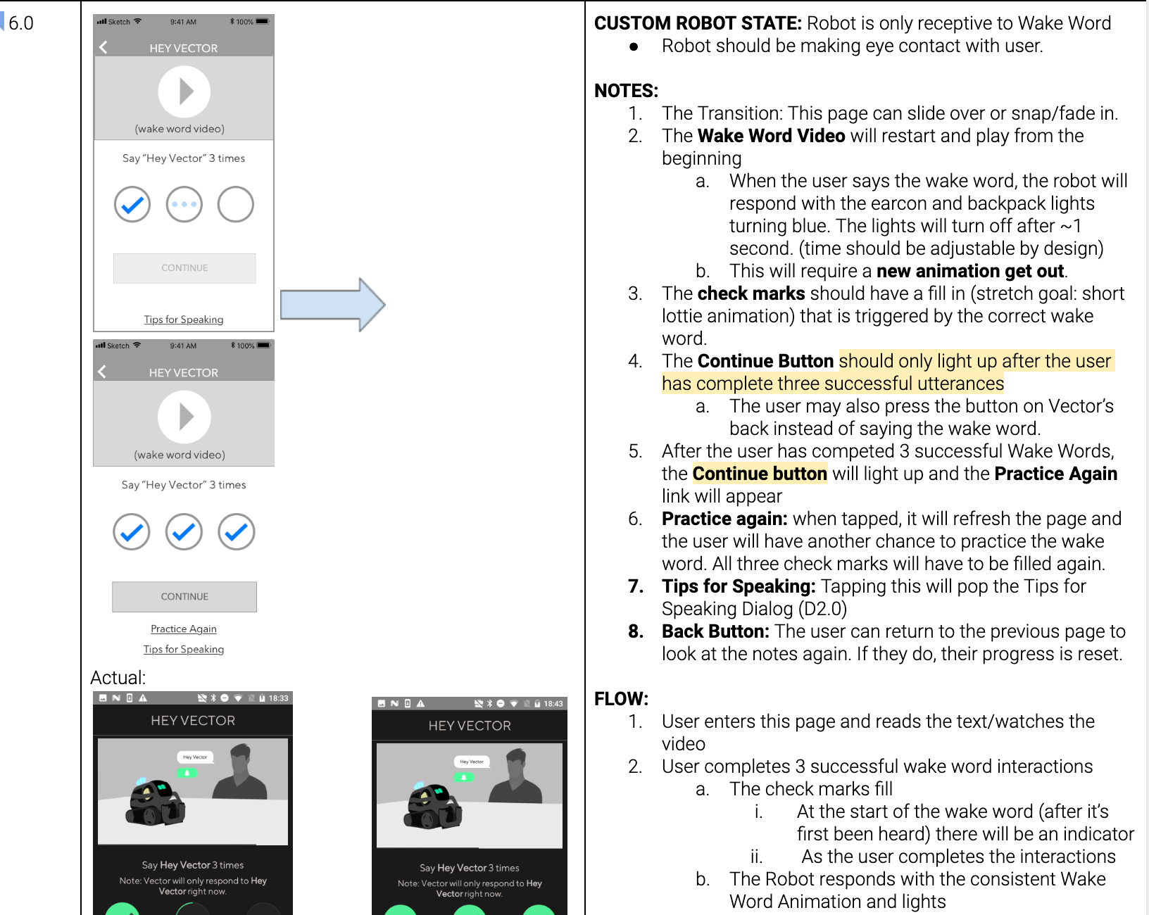
A small piece of the UX Doc for Onboarding that I created. It was important to capture app and robot states
My first pass at Onboarding differentiated sections cleanly. This allowed us to pace the user’s attention to limit attention splitting between device and robot. Each section felt contained and bite sized, while reinforcing previous learnings. They also all felt celebratory, allowing the user some mental respite and feelings of achievement.
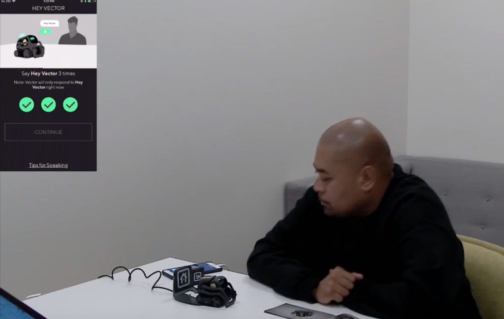
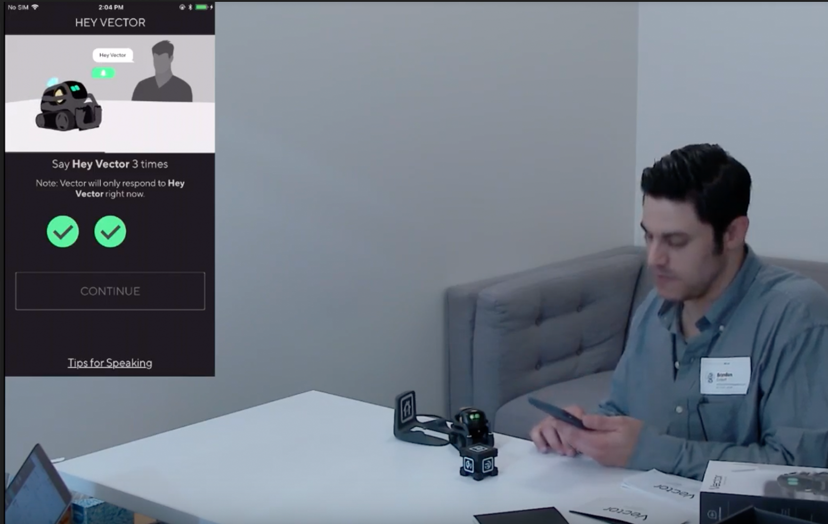
I created flow diagrams, wires, and a workable prototype so User Research could be testing as soon as possible. The faster we got Onboarding in front of users, the sooner we could refine and adjust.
What We Learned
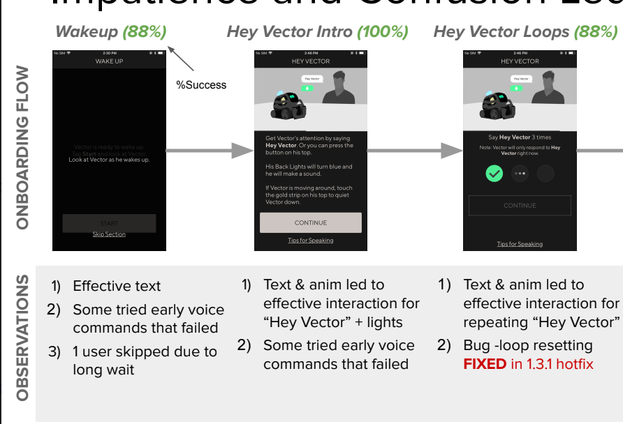
Users were not overwhelmed and felt confident by the time the Onboarding finished. However the users didn’t always understand what difference between a successful trigger and an unsuccessful one. To fix this many teams worked to iterate on the
ear-con, light states, and messaging.
We ended up pivoting away from this type of flow. It relied heavily on the robot being authoritative. The specific steps required the robot and app to constantly be in sync which was an impossibility due to connection issues and general user behavior.
What We Ended On
Vector’s magic exists in the user’s interaction with the robot and their exploration together. So we got rid of the heavy handed app guide.
We kept the delight of Vectors “waking up” moment, and then quickly taught the user how to interact with their robot. By using repetition and clear indication of a successful trigger, users came away much more confident on what meant success and what meant failure. The app flow ended up much shorter, but doesn’t push the user along. At the end of the flow, we gently guide the user to specific
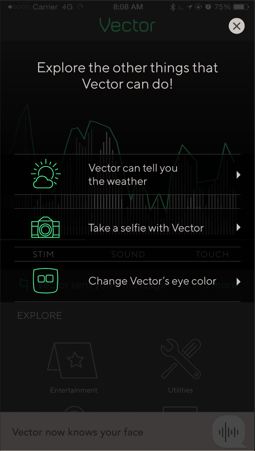
commands. We provided support material later in the app too, for anyone that wanted a refresher.
We switched over to being app authoritative. This cleaned up a lot of our edge cases and sync issues.
These changes improved results greatly.